UI Components8 min read
In the AI Era, Brands Fail When Every Asset Looks Different
Repeat shape, surface, type rhythm, and motion—not a new pretty style every time you prompt.
AI made visual production faster. One clear prompt can yield a batch of decent directions quickly. The new problem: each image looks fine alone, but the set does not feel like one brand—minimal SaaS today, editorial Swiss tomorrow. Users cannot remember you.
Brands do not need a new style every time. They need repetition: the same shape logic, surface treatment, and typographic rhythm. After enough repetition, people think: that still looks like you.
A visual language can start as four layers.
Shape
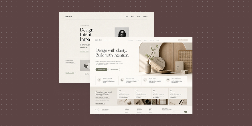
Shape is the skeleton—buttons, cards, icons, modules: round or sharp, ordered or loose. If shape language shifts every generation, the brand scatters.
Shape Design
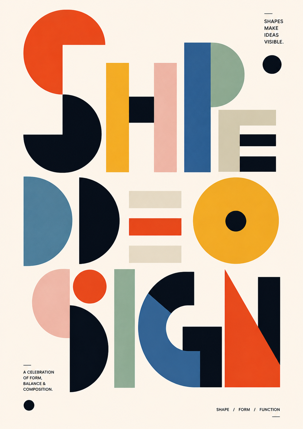
Shape Design
Shape cards anchor outline first: what do this brand’s graphics look like—not a full page yet.
Surface
Surface is touch—flat clean, glass, paper, metal, quiet or high gloss. Many brands feel inconsistent because surface language changes, not only color.
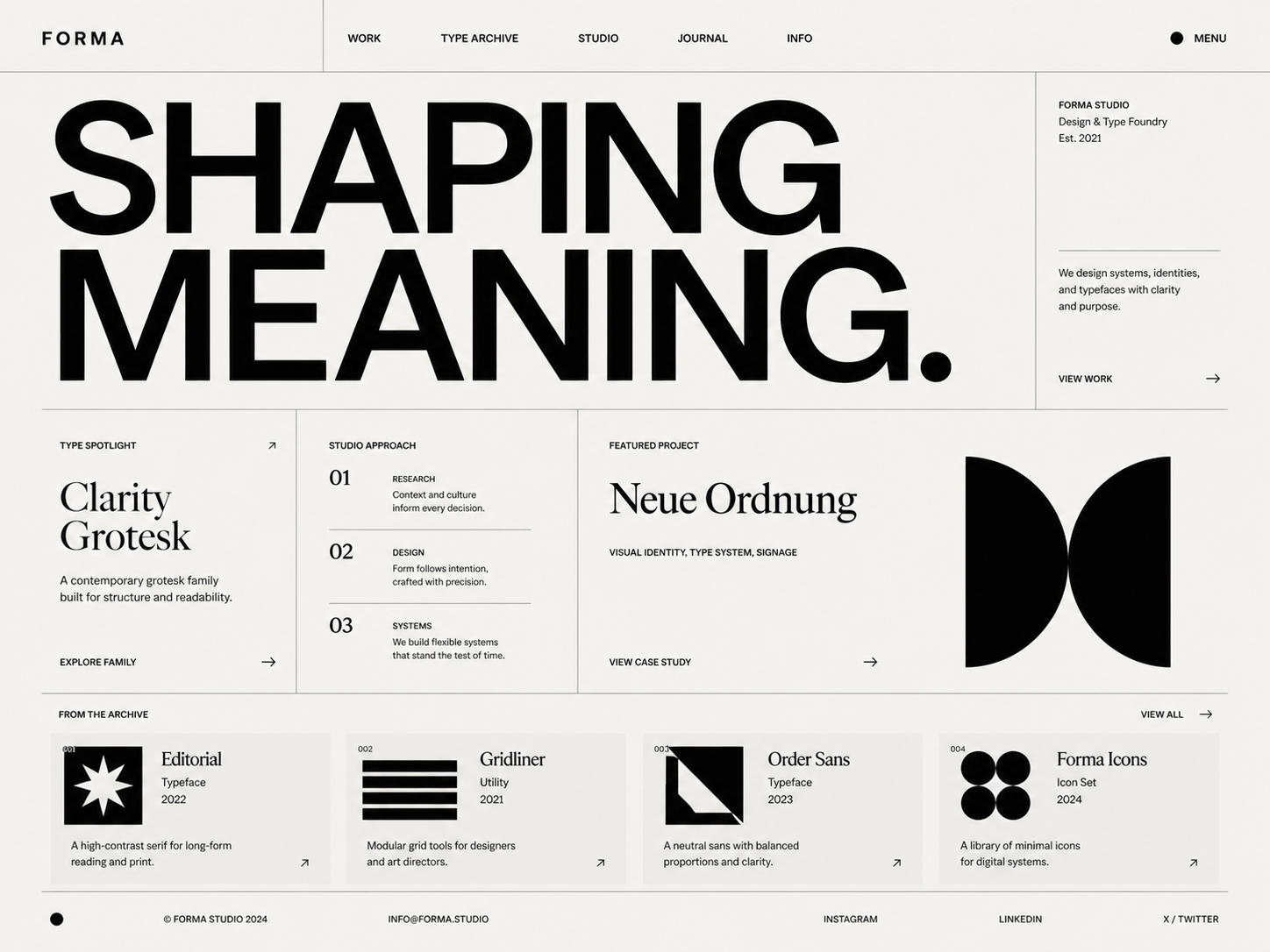
Minimal / Clean
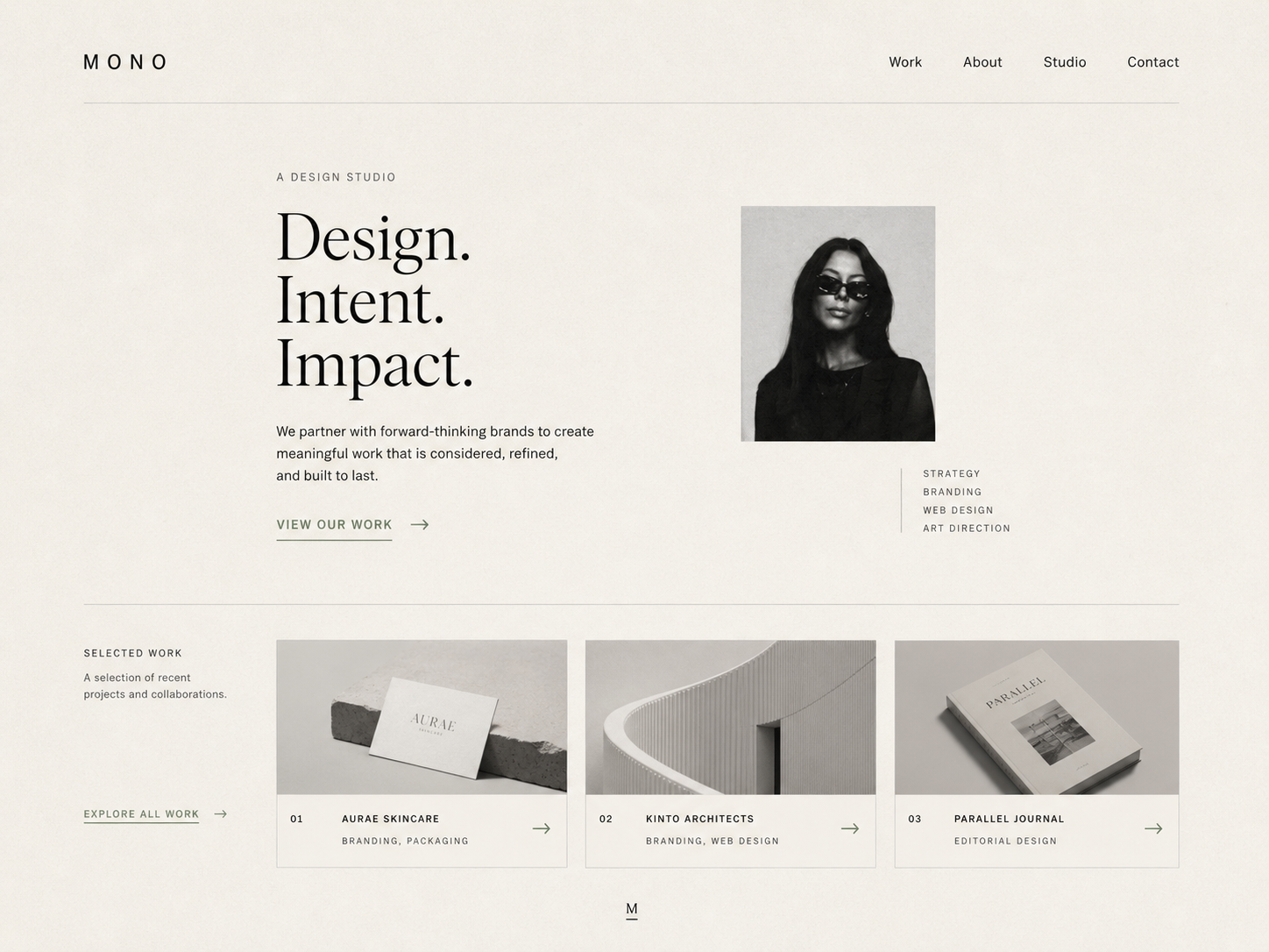
Minimal / Clean
A clean, restrained surface baseline stabilizes the brand before you extend to components, pages, and posters.
Type rhythm
Brands also fall apart when type rhythm wobbles—headlines swing in size, grids tighten then disappear, editorial one day and campaign poster the next. Stable rhythm boosts recognition fast.
Editorial / Swiss
Editorial / Swiss
Editorial Swiss–style cards encode grid, headline levels, and typographic discipline so information pace stays familiar across pages.
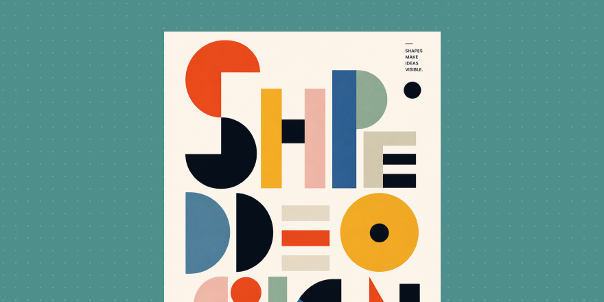
Motion character
Motion shapes memory too. Calm one moment and neon flash the next feels like a broken temperament. Motion can be light, quiet, mechanical, elastic, or high energy—but it should stay consistent.
Neon / Cyberpunk
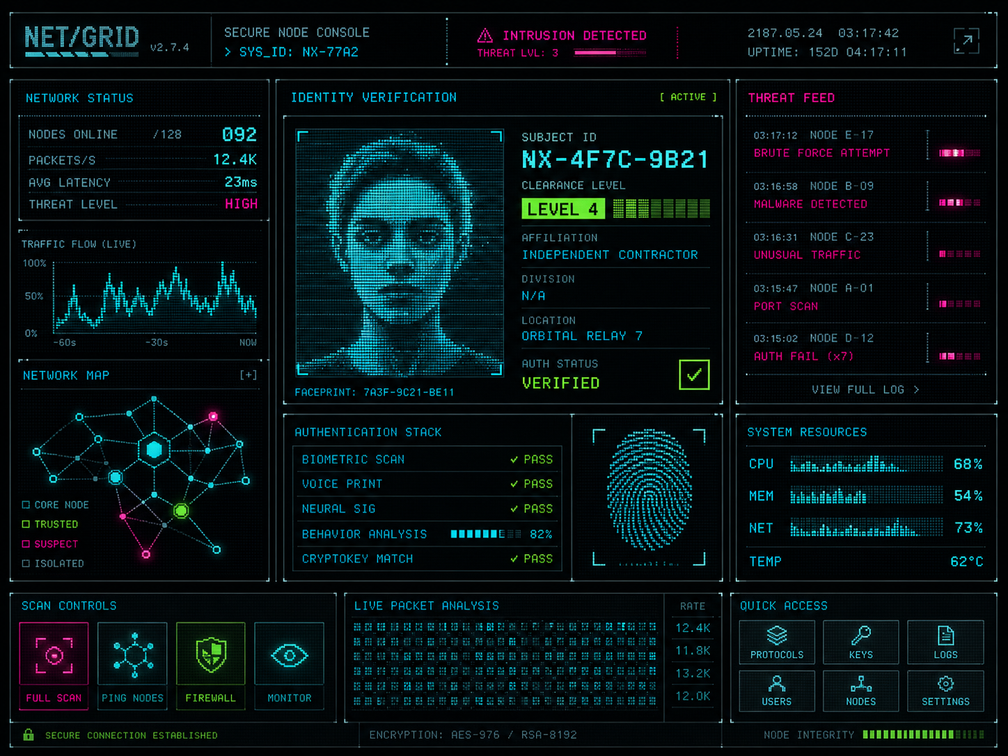
Neon / Cyberpunk
Neon cyber is not for every brand; it reminds us motion has personality. Use high-energy direction only when the brand truly allows strong expression.
What AI brand work needs most is not speed—it is boundaries. Clear boundaries let AI output stay stable; vague boundaries give you another beautiful one-off every time.
In Draftroom, cards are not only inspiration. They split reference into reusable layers—shape, surface, type, motion. Lock each layer, and later images, pages, posters, and components grow from the same brand.