UI Design Commands8 min read
ChatGPT Image 2 + Codex: Speed Up Your UI Design Workflow
Four practical loops—targeted edits, mobile adaptation, Mobbin references via Codex, and sharper UI prompts—with copy-ready cards in Draftroom.
Generating UI with AI is not new. What actually saves time is not “draw me a page once”—it is plugging Image 2 and Codex into the full UI loop: first draft, layout tweaks, mobile adaptation, reference gathering, and sharper prompt language. Here are four loops we use often.
1. Edit precisely—do not regenerate the whole screen
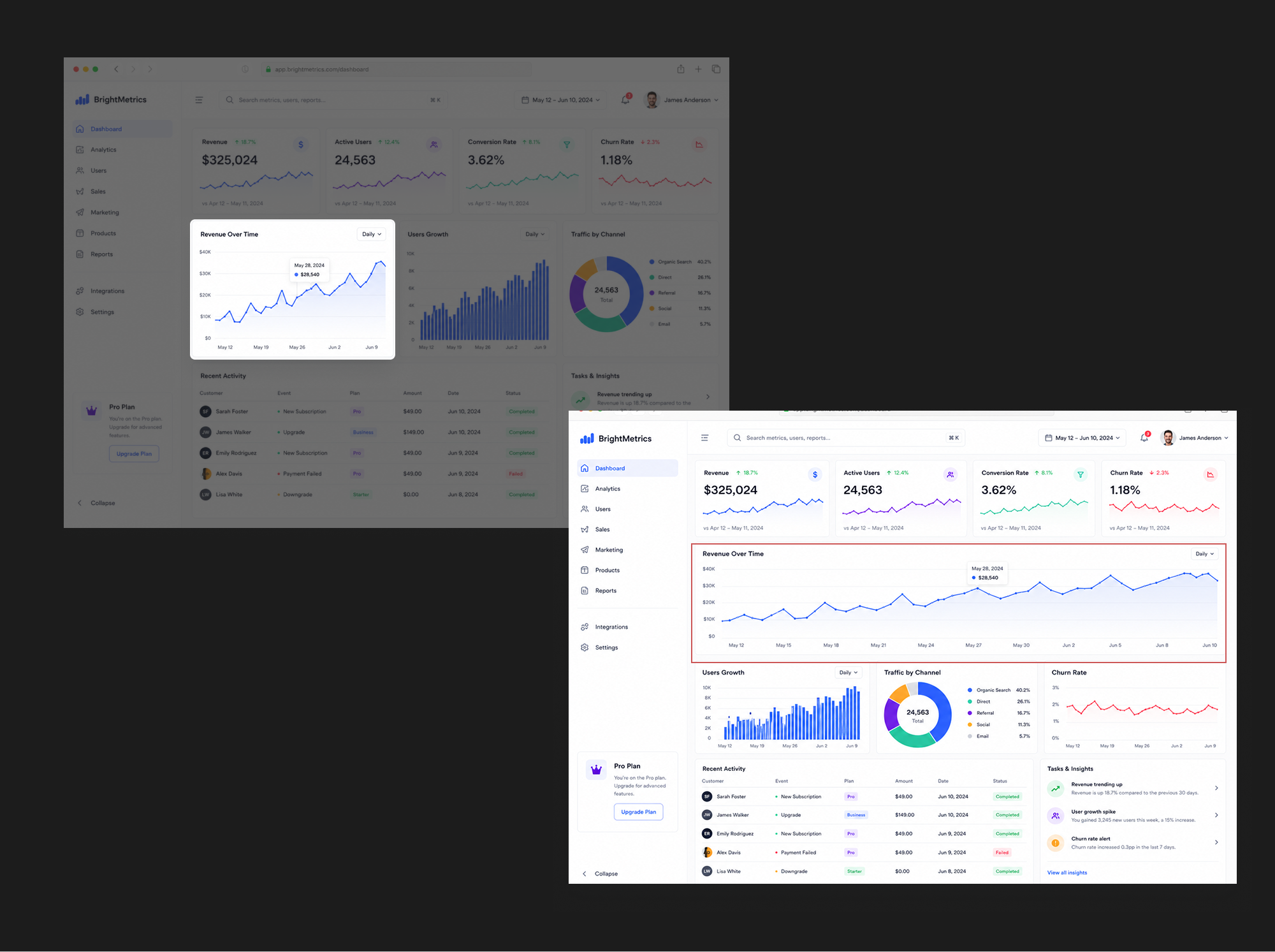
Many people ask Image 2 for a complete page on the first try. It is often better at targeted edits on an existing mockup.
You already have a finance dashboard, but the asset-allocation module does not feel primary enough. You do not need a giant new prompt—just say what moves and what stays:
Move Module to First Row
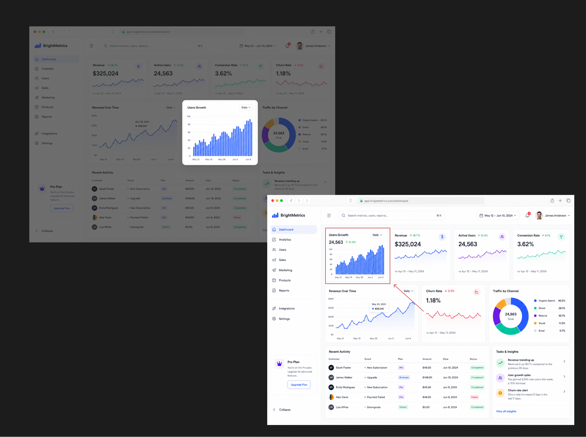
Move Module to First Row
Emphasize Chart Area
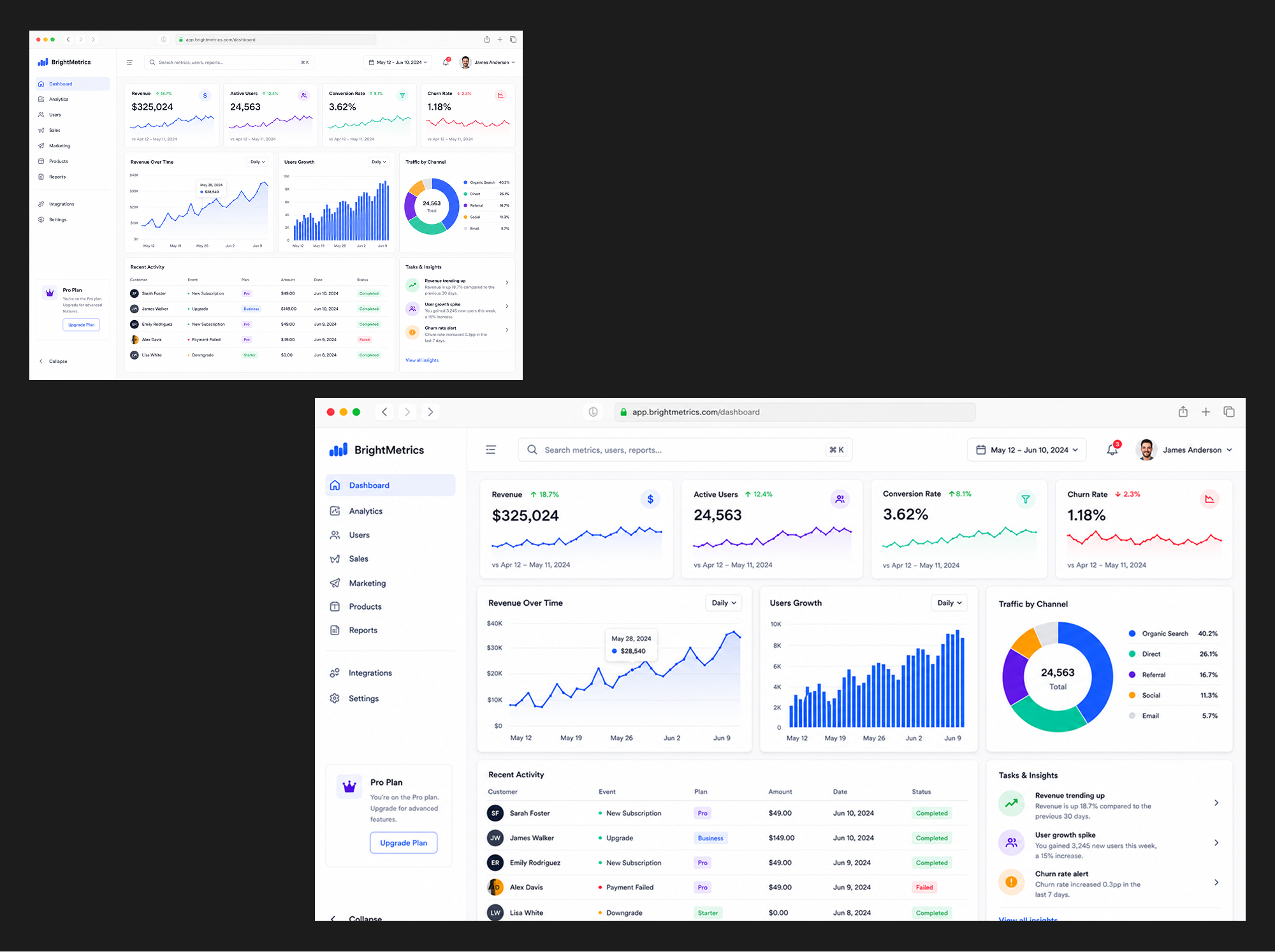
Emphasize Chart Area
Enlarge KPI Cards
Enlarge KPI Cards
Increase Module Spacing
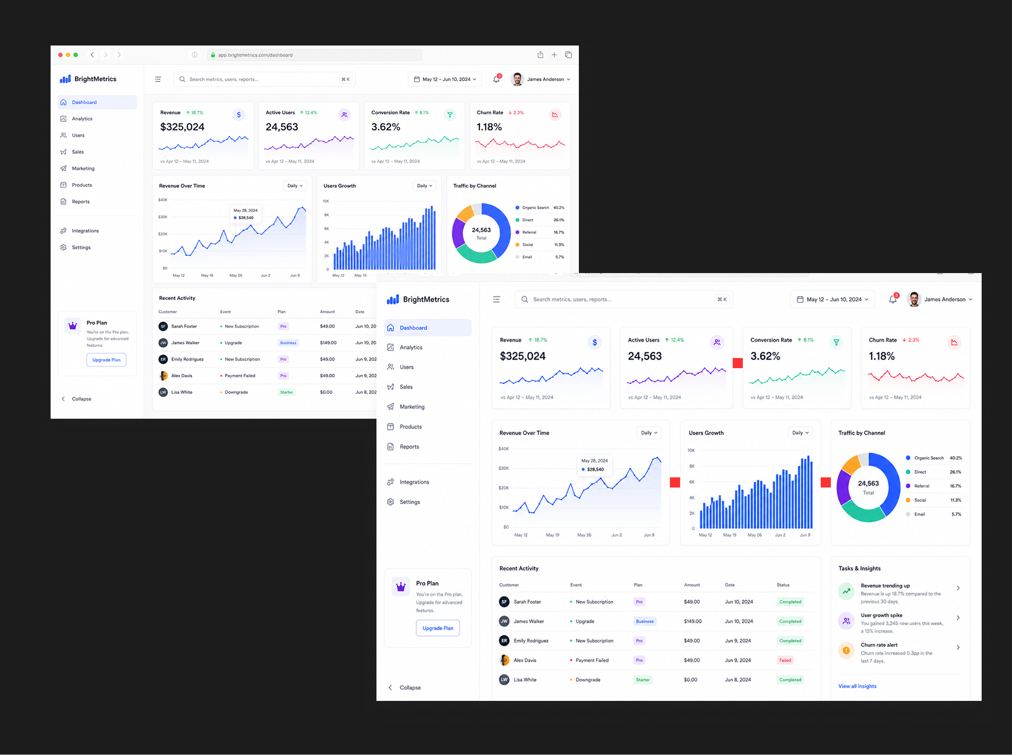
Increase Module Spacing
Emphasize Primary Button
Emphasize Primary Button
Make Module Full Width
Make Module Full Width
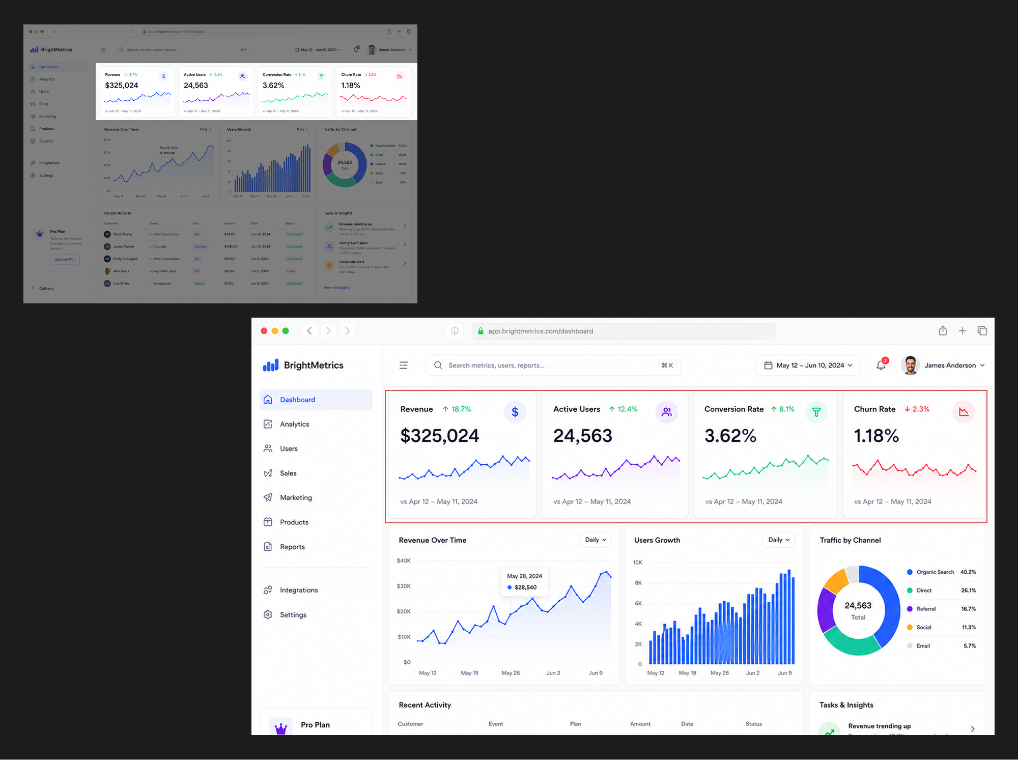
Or the chart zone feels too quiet. Ask for hierarchy without rebuilding the page:
Based on the attached UI mockup, make the [chart area] more prominent. Do not change the overall page structure.
This is for testing UI directions fast: module order, focal weight, card emphasis, spacing, local layout—same style, different emphasis. Good edit prompts are specific: what changes, what stays, what must not change.
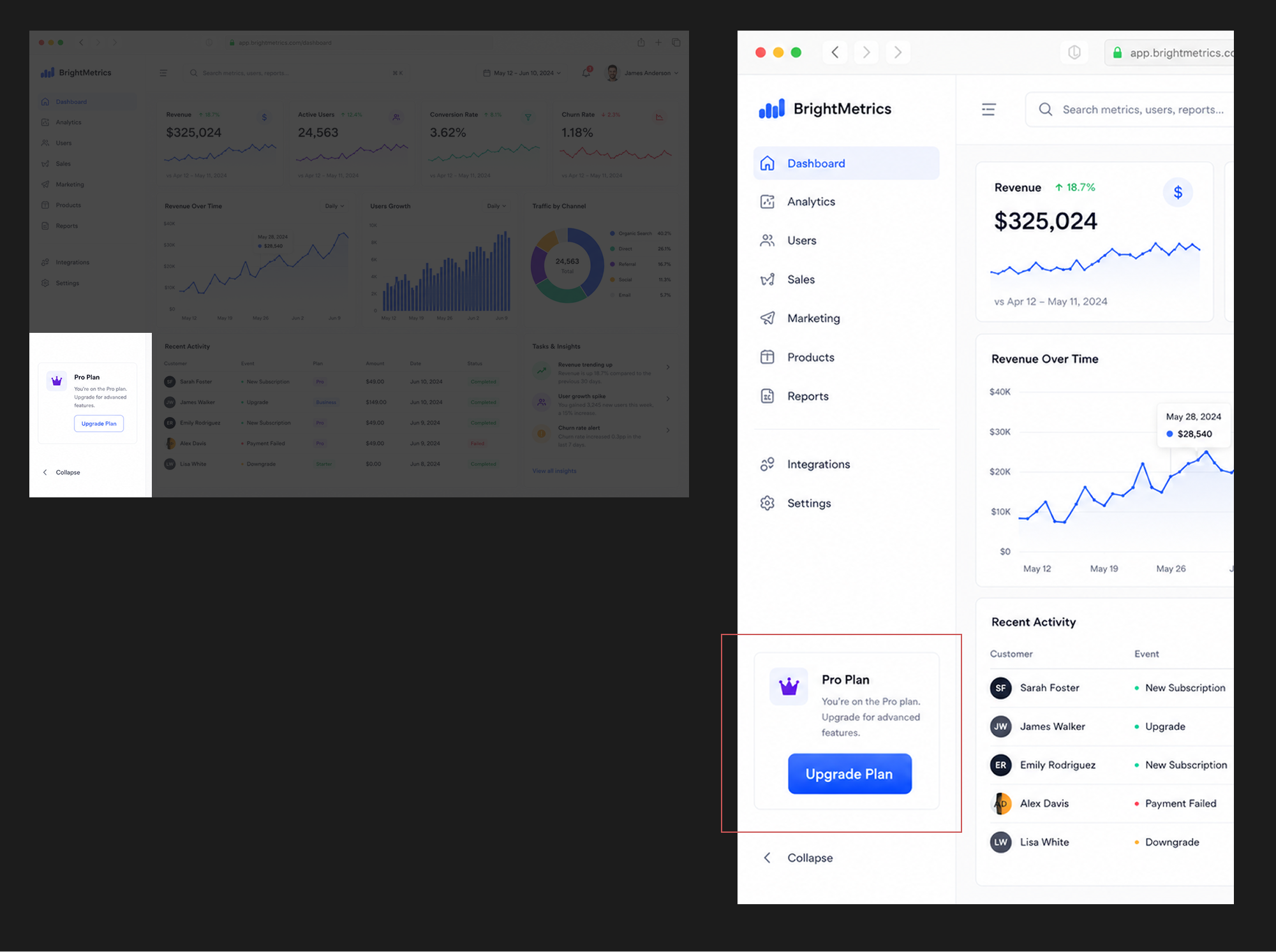
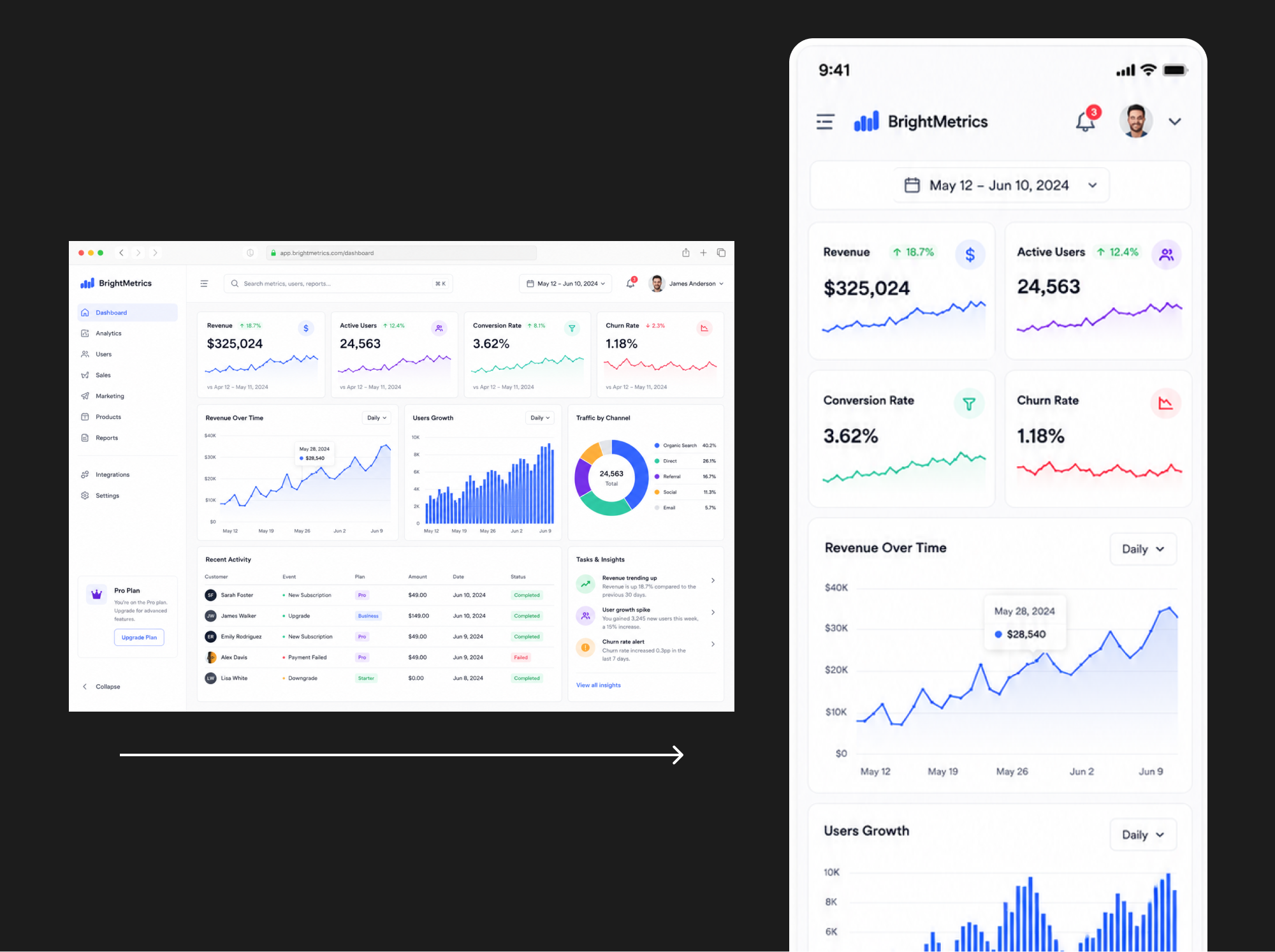
2. Desktop to mobile—fast structural options
You have a desktop dashboard but are not sure how mobile should reorganize information. Send the desktop frame to Image 2 and ask for a mobile mockup:
Desktop UI → Mobile Mockup
Desktop UI → Mobile Mockup
The value is not shrinking the desktop layout—it is rethinking priority: what appears first, how cards stack, how much chart area a phone deserves, what to fold or soften, and how touch targets and spacing should feel. You may not ship the first output, but you quickly see two or three mobile information architectures instead of排版 from zero.
3. Codex + Mobbin MCP for reference gathering
Codex works well with reference images, design rules, and existing code. With Mobbin MCP connected, you can ask Codex to pull relevant UI references from Mobbin. For example:
I'm building a [product type] app. Find dark-mode desktop dashboard references on Mobbin.
This speeds up early reference sorting: page structure in the category, dark-mode treatment, card layouts, chart presentation, navigation, filters, detail patterns—design modes that fit your product direction.
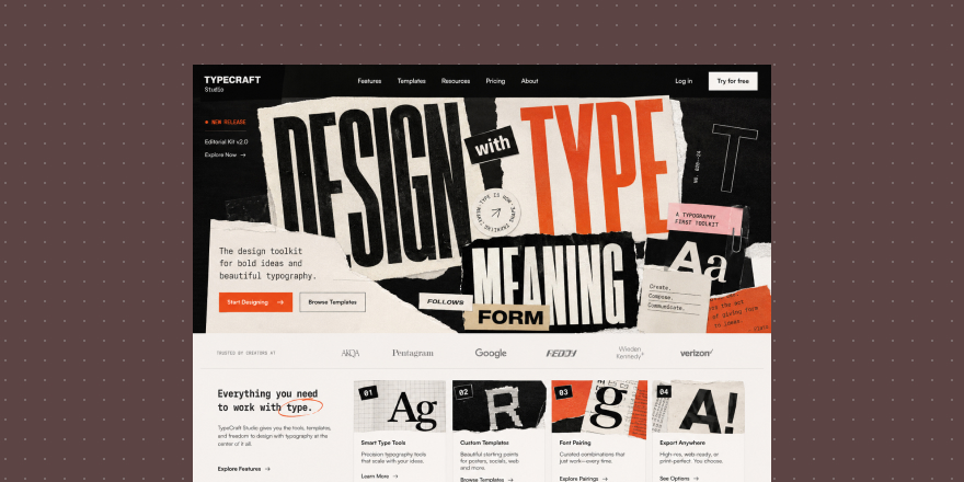
4. Sharper UI prompts—describe how it should be designed
Many UI outputs look “not professional enough” because the prompt only says generate a premium finance dashboard. That is too wide—the model fills gaps with generic defaults.
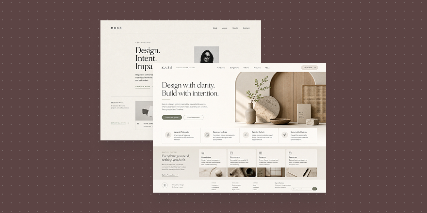
Better prompts name the design vocabulary—often by combining UI component prompts from the catalog:
Stat Card
Line Chart
Metric Grid
Dashboard Shell
Metric Overview Grid
Time Range Picker
Combine UI component prompts (KPI tile, chart, metric grid) with UX layout and interaction cards (dashboard shell, overview grid, time-range picker). Paste them into Image 2 together with your style rules. Words like clean SaaS dashboard, soft shadows, subtle borders, rounded cards, clear visual hierarchy, and readable data visualization steer hierarchy, card finish, charts, and overall polish.
Summary: AI helps the steps—not one perfect frame
Image 2 and Codex are most useful when they compress small steps in the UI workflow:
- Quick UI concept frames
- Targeted edits on existing mocks
- Desktop → mobile exploration
- Codex-assisted reference sorting
- More professional prompt language
They do not replace your judgment—but they shorten the distance from idea to visual direction. Start with these four loops if you are experimenting with AI UI work.