UI Components9 min read
How to Choose UI Styles: Tell Confusable Design Directions Apart
Similar-looking UI styles solve different problems—compare pairs, boundaries, and fit before you brief AI.
When people use AI for UI, they often start with a single style word—minimal, clean, glassmorphism, brutalist, high contrast, soft UI. Convenient, but risky: many directions look alike yet behave very differently in real products.
A productivity tool can turn too soft. A lifestyle product can turn too cold. A page that must be easy to read can become “cool but unusable.” So do not only ask if a style looks good. Ask what product it fits, what problem it solves, and where its boundary is.
Japandi vs Minimal Clean
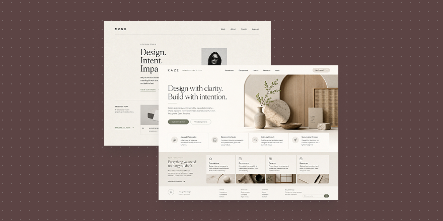
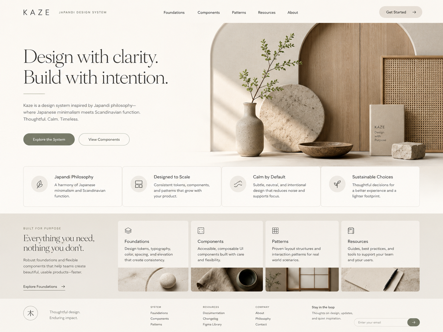
Both stay clean and low on decoration, but the temperament differs. Japandi is warmer, with a touch of life and material—good for health, lifestyle, learning, and personal tools where users need calm and trust, not only task completion.
Japandi
Japandi
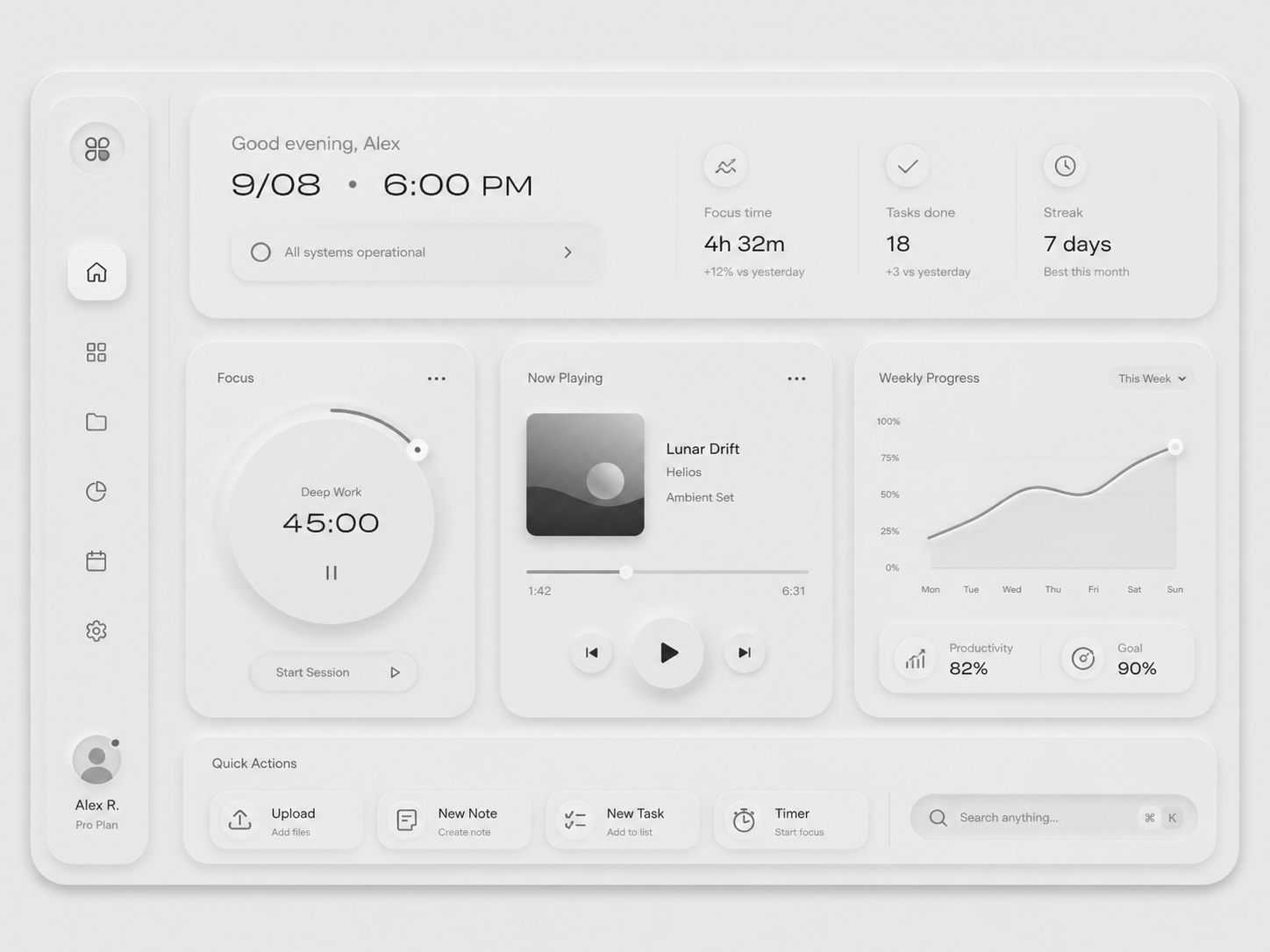
Minimal Clean is more neutral and efficiency-first—better for B2B consoles, SaaS, data products, and workflows where clarity and stable paths matter more than atmosphere.
Minimal / Clean
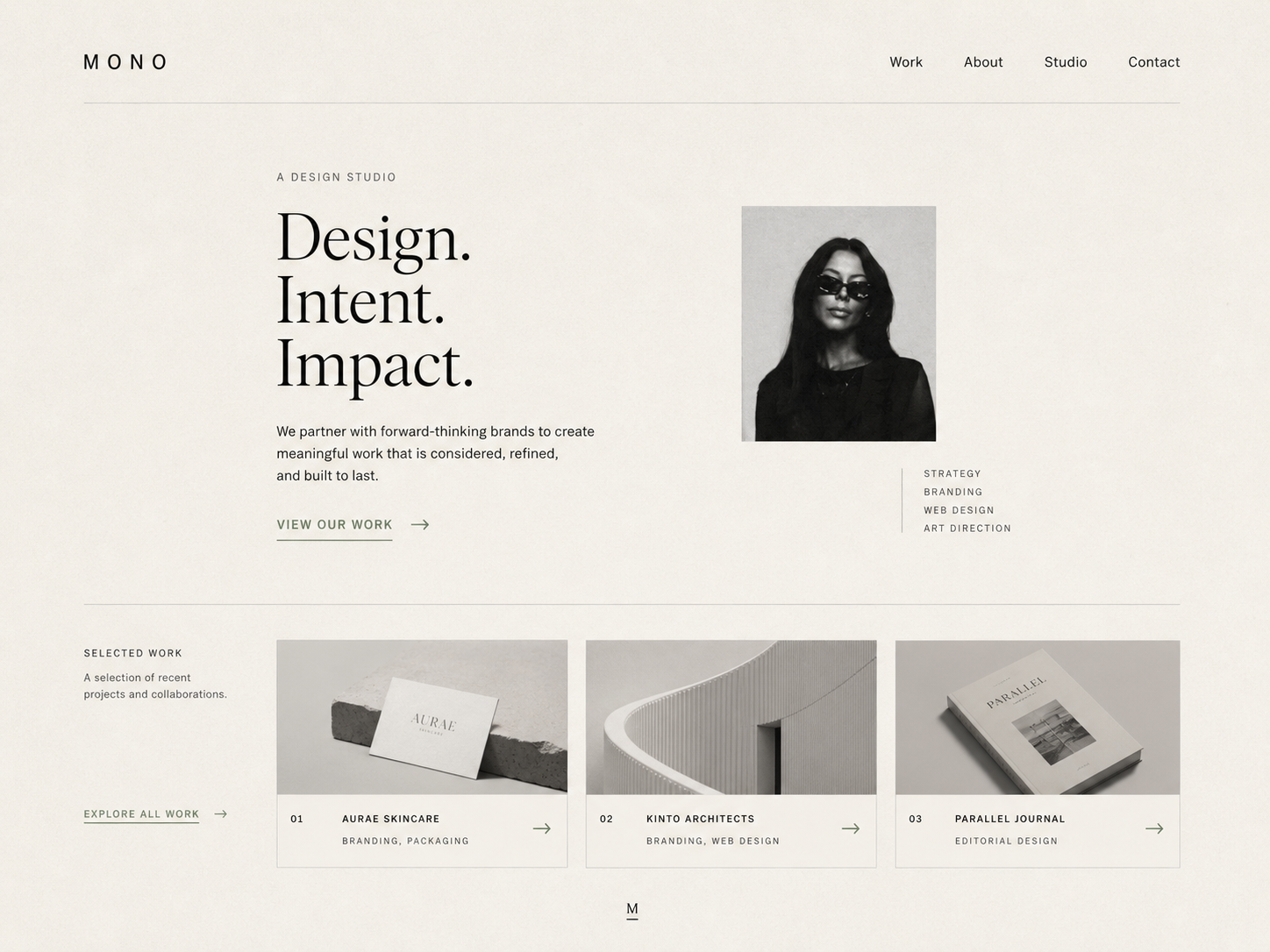
Minimal / Clean
Meditation, wellness logs, or lifestyle apps often need Japandi’s closeness. CRMs, project tools, and dashboards usually need Minimal Clean. Both can look “clean”—one leans toward the user, one toward getting work done.
Brutalist vs High Contrast
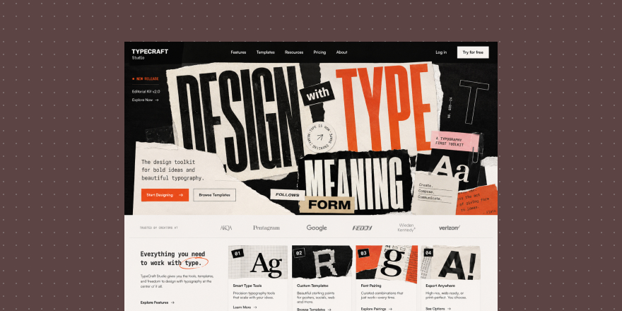
Both feel strong and visual, but the purpose differs. Brutalist is expression—raw, direct, sometimes deliberately unpolished. It fits campaigns, art, music, street brands, and experiments where attitude matters.
Brutalist
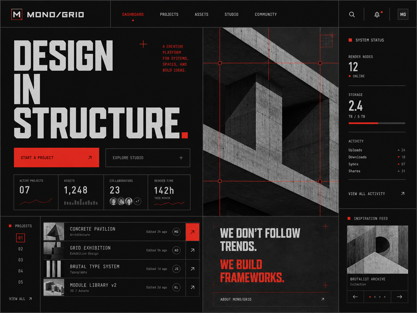
Brutalist
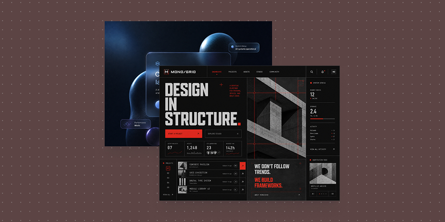
High Contrast is an information strategy—not “cool,” but clear hierarchy. Use it when density is high, readability is critical, and status must be read fast.
High Contrast
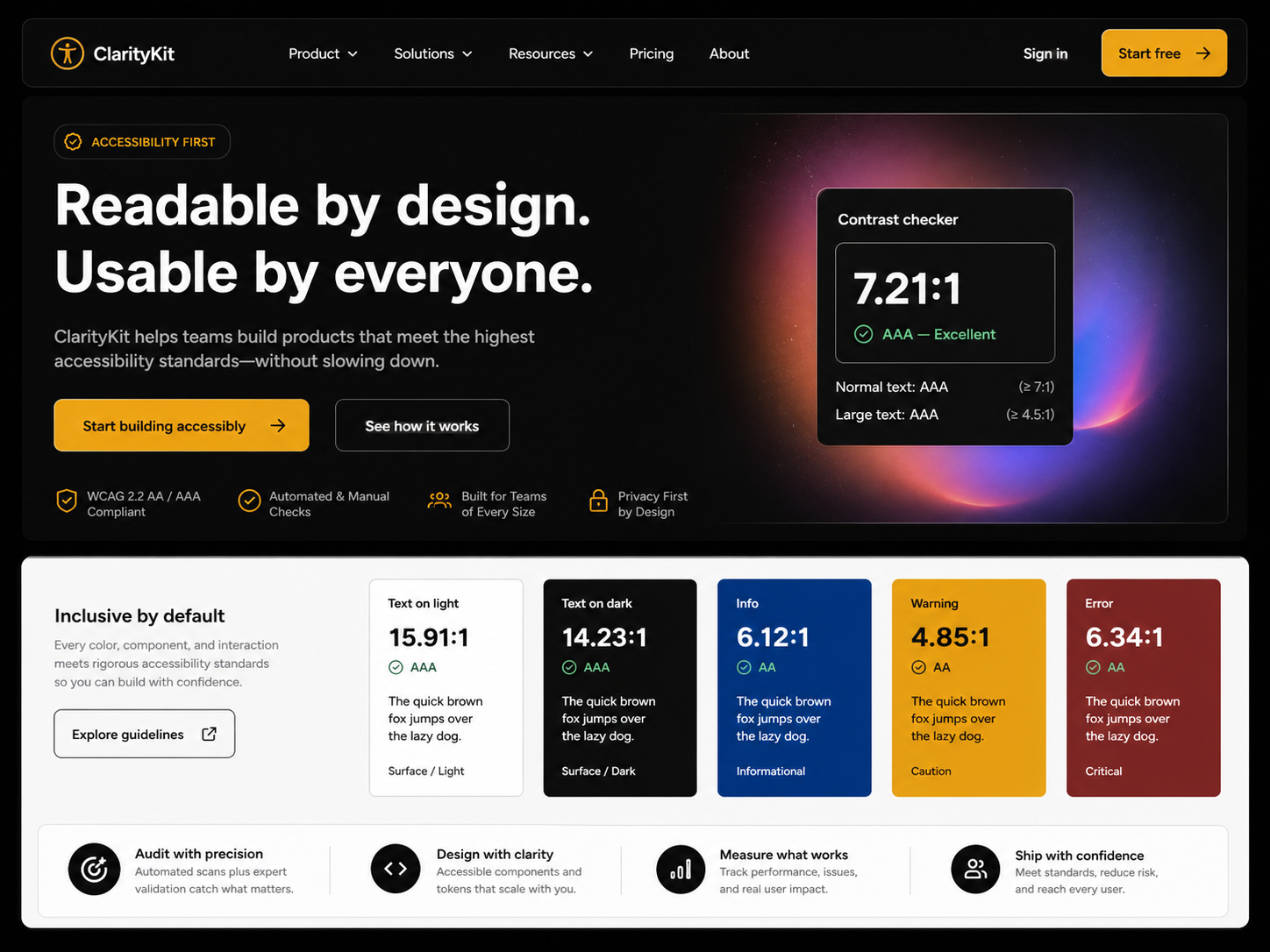
High Contrast
Do not put brutalism on enterprise or finance dashboards just for impact. If the page needs hierarchy, high contrast wins. Brutalist speaks attitude; high contrast organizes information.
Glassmorphism vs Neumorphism
Both skew soft and “premium,” but the spatial logic differs. Glassmorphism stacks translucent layers—music, weather, assistants, creative tools, visual dashboards where depth and floating panels help.
Glassmorphism
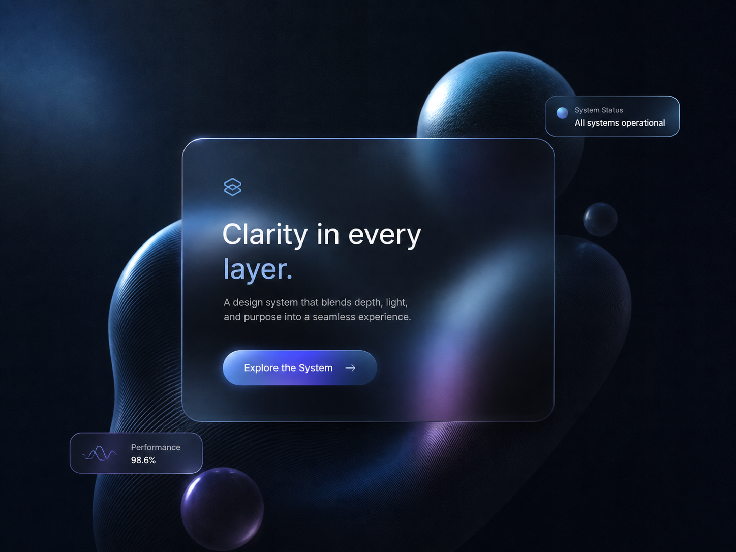
Glassmorphism
Neumorphism emphasizes surface—controls that seem to lift from one plane. Good for small control sets, dashboards, smart home, and panels with few primary actions.
Neumorphism
Neumorphism
Glass fails when backgrounds fight text. Neumorphism fails when affordance is weak—users cannot tell what is clickable. Judge glass on front-to-back depth; judge neumorphism on embossed surface.
Three questions before you pick
First: should the product feel close or distant? Health, education, and lifestyle can be closer; B2B, finance, and efficiency tools usually stay restrained.
Second: how dense is the screen? More information means hierarchy and readability beat atmosphere.
Third: does the product need attitude or predictable completion? Creative brands can be bolder; tools should stay clear first.
Style is not a skin—it shapes first impression, components, spacing, color, states, and hierarchy. In Draftroom, Style cards help you choose direction: temperament first, then the matching style card, then tokens, components, and layout—not a random pretty skin.