Ecommerce6 min read
Stop Writing “Premium Lighting”—AI Cannot Guess Which Premium You Mean
Split “premium” into material, dark-stage mood, and ad layout—then pick the matching prompt cards.
Many people add “premium lighting” to AI product prompts. It sounds right—but premium is not one kind of light.
Cold, precise highlights on metal can feel premium. A dark stage with a tight pool of light on fragrance can feel premium. Clean Apple-style whitespace with a hero product can feel premium. They all read as high-end, but the lighting logic is completely different.
When you only write premium lighting or high-end product photography, the model guesses.
Material-first premium
If you want the product to feel more tactile, light has to serve material. Metal, glass, ceramic, plastic, and paper react differently.
Cold metal gloss suits metal, tech hardware, tools, accessories, and precision products. It pushes cool key light, edge highlights, and controlled reflections—harder, more exact, more industrial.
Cold Metal Precision Light
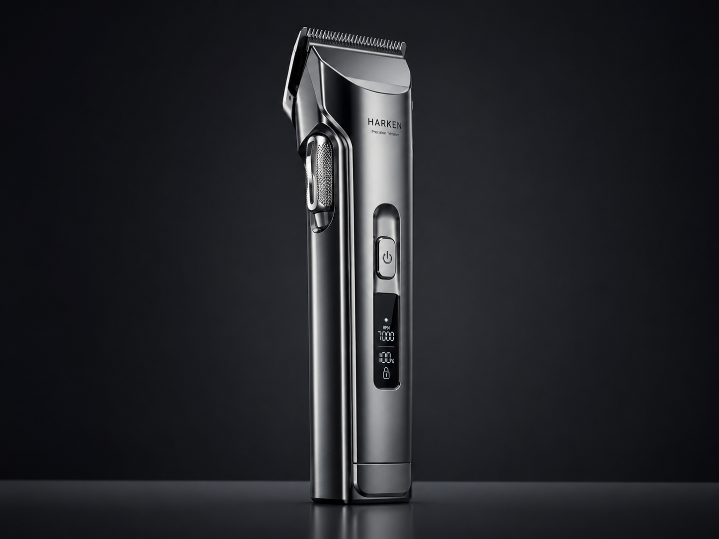
Cold Metal Precision Light
Mood-first premium
If you want a brand key visual, light starts creating distance and emotion. Darker backgrounds, focused beams, and clear contrast turn a SKU into the subject—not just a packshot.
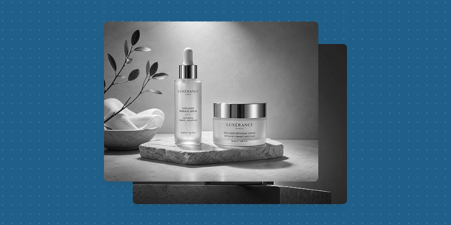
Dark Luxury Black Stage Light
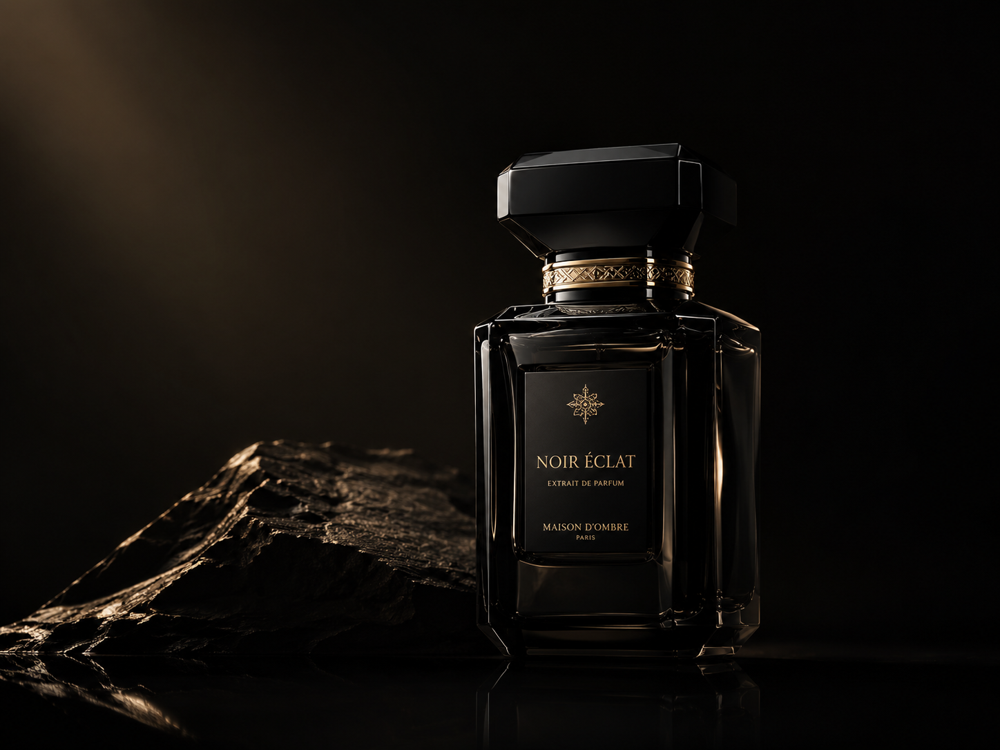
Dark Luxury Black Stage Light
Spotlight Luxury Product KV
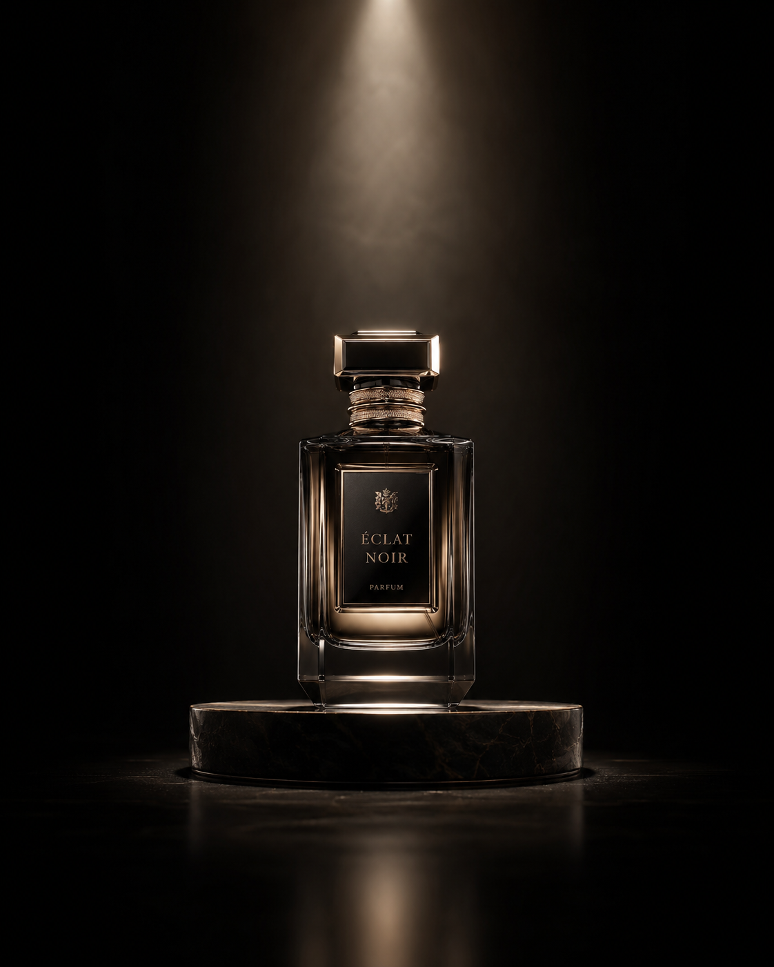
Spotlight Luxury Product KV
Dark luxury black-stage light suits fragrance, beauty, spirits, gift sets, and launch visuals. It pulls the background down so the product is held by light alone—restrained and expensive.
Spotlight luxury KV suits stronger campaigns and brand posters—more stage than catalog, for ritual, release, and a clear visual center.
Layout-first premium
If the image must land on a site, ad, or social cover, “premium” also means layout. Many AI images look great alone but have nowhere for type or hierarchy. Usable brand work plans product, whitespace, headline, and rhythm together.
Minimal White Space Brand Poster
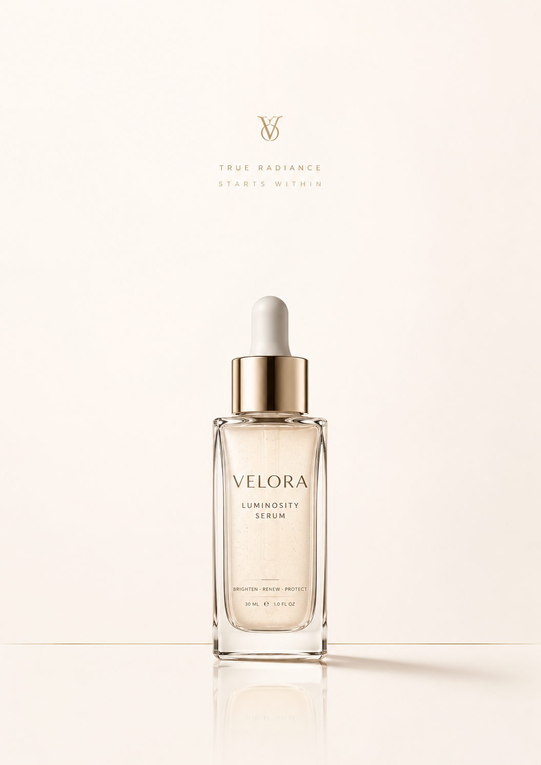
Minimal White Space Brand Poster
Diagonal Crop Product Ad
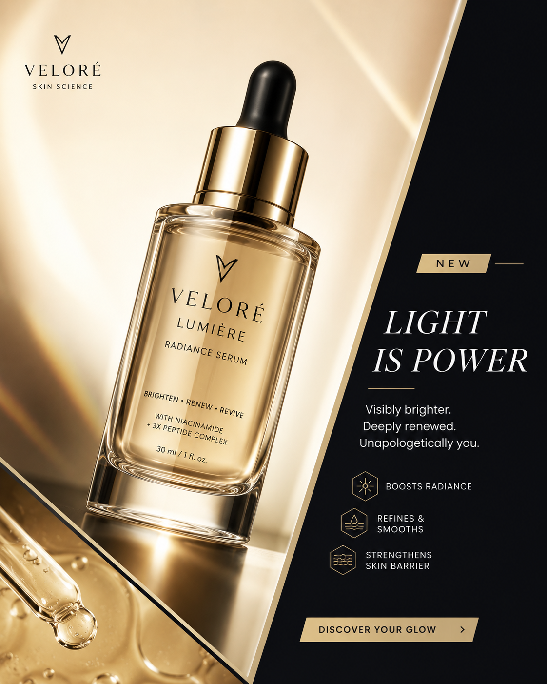
Diagonal Crop Product Ad
Minimal white-space brand poster suits site heroes, brand intros, and benefit pages—clean room so product, title, and copy work together.
Diagonal crop product ad suits sales beats, social covers, and paid media—more motion than a straight packshot when you need attention fast.
Stop using one vague word
Next time, do not stop at “premium lighting.” Ask: material premium, mood premium, or layout premium?
Pick the direction first, then tune product, brand temperament, and scene. In Draftroom, these directions are separate prompt cards—choose material, dark-stage, or ad layout, then refine on your SKU.