Ecommerce6 min read
Why Does AI Make Every Product Look Like a Skincare Ad?
AI’s default soft, dewy look is flattening category character—and how to pull products back with the right prompt cards.
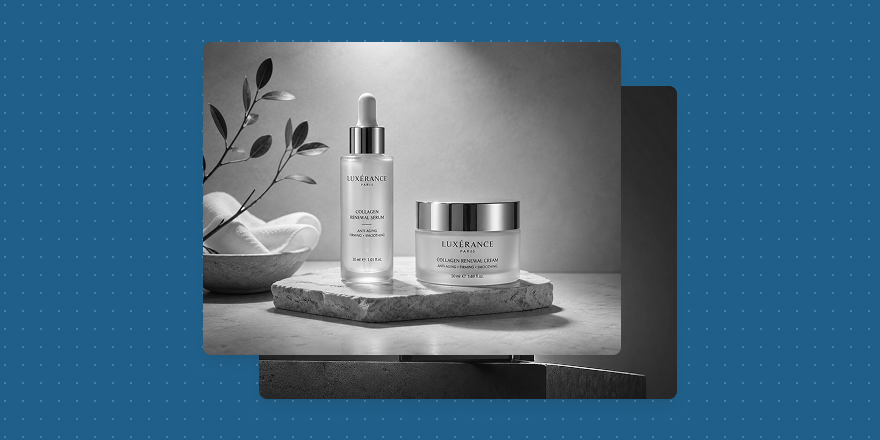
I’ve been looking at a lot of AI product images lately, and one pattern keeps showing up: AI really wants to shoot everything like a skincare ad. Pale backgrounds, soft light, watery sheen, the product floating gently in the middle. The first glance is beautiful; after a dozen frames it gets tiring.
That’s interesting in itself. AI understands a very safe kind of “premium”—clean, soft, almost instantly brand-ad ready—so it becomes the default answer.
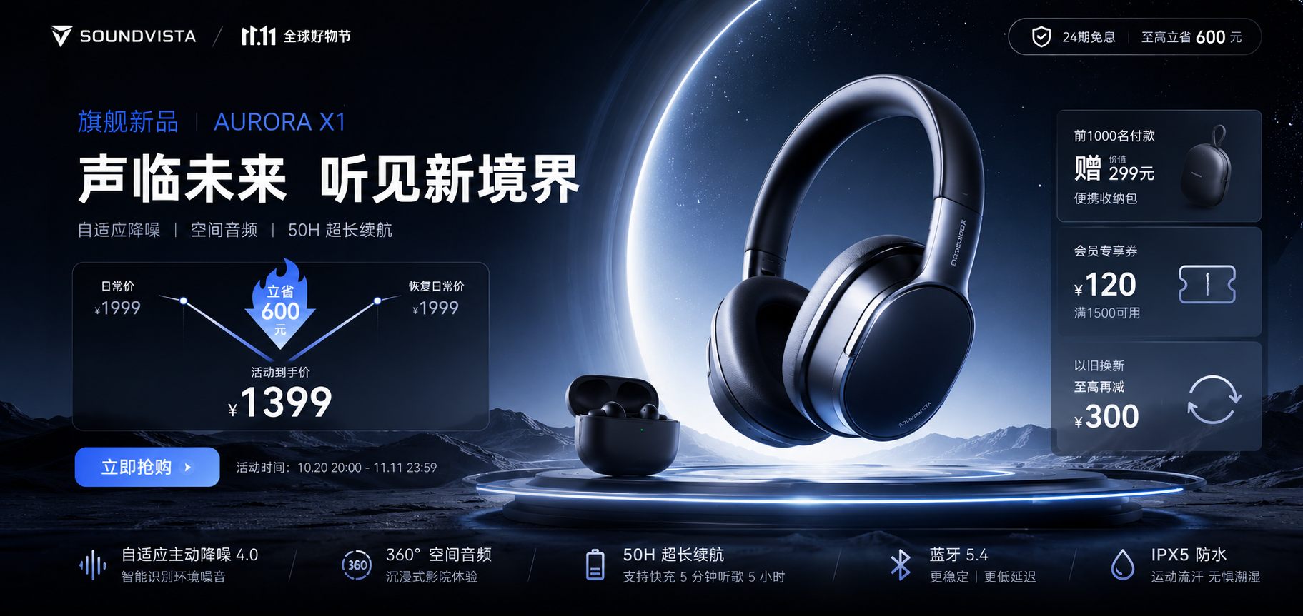
But product images aren’t only about looking good. They should preserve what the product is. Tech shot too soft loses performance cues. For headphones, devices, and smart hardware, I’d rather push a cooler, sharper read: clear edges, explicit structure, a harder frame.
Metal Shard Tech Poster
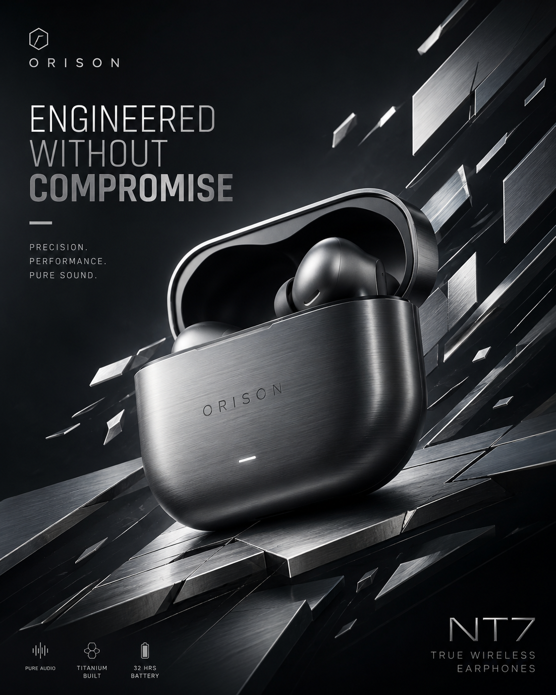
Metal Shard Tech Poster
Festival Tech Promo Banner
Festival Tech Promo Banner
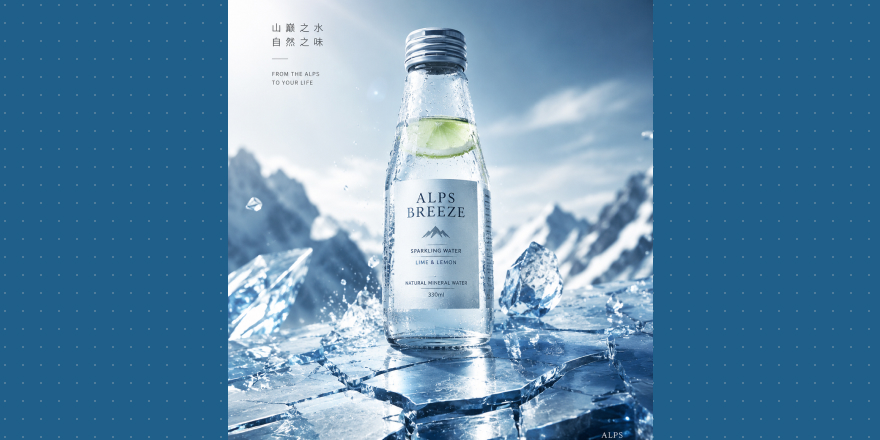
Drinks and food get pulled off-course too. They can have water language—but it should evoke ice, bubbles, freshness, and appetite, not skincare hydration. Drinks should make you want to drink; food should make you want to eat. That matters more than “clean premium.”
Ice Crack Drink Hero
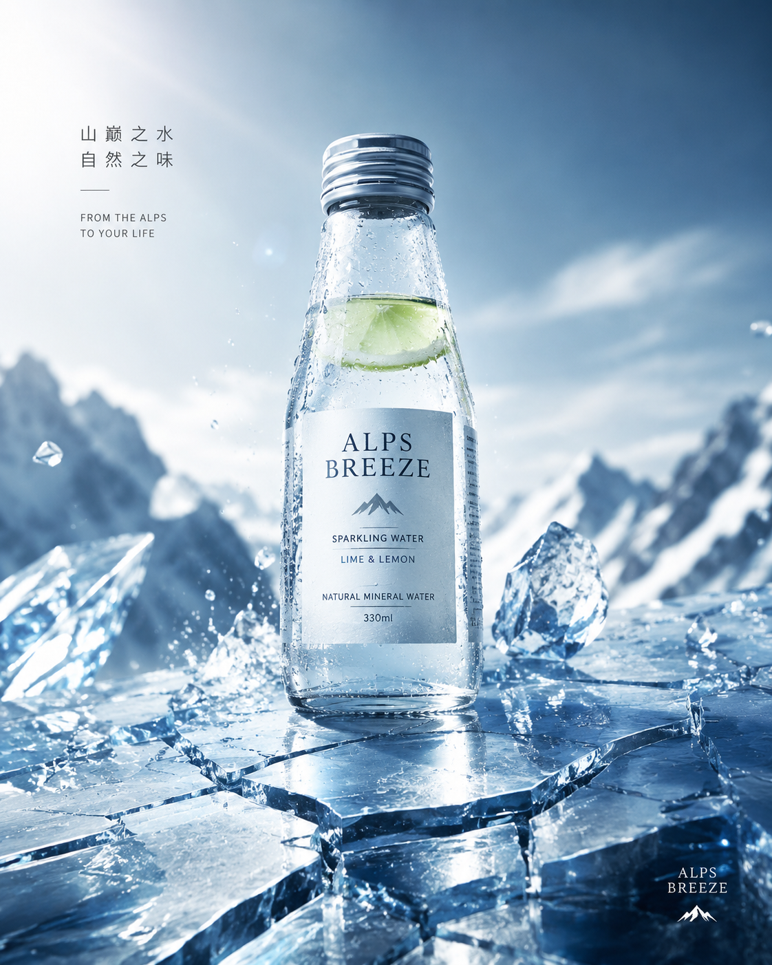
Ice Crack Drink Hero
Organic Cutout Food Hero
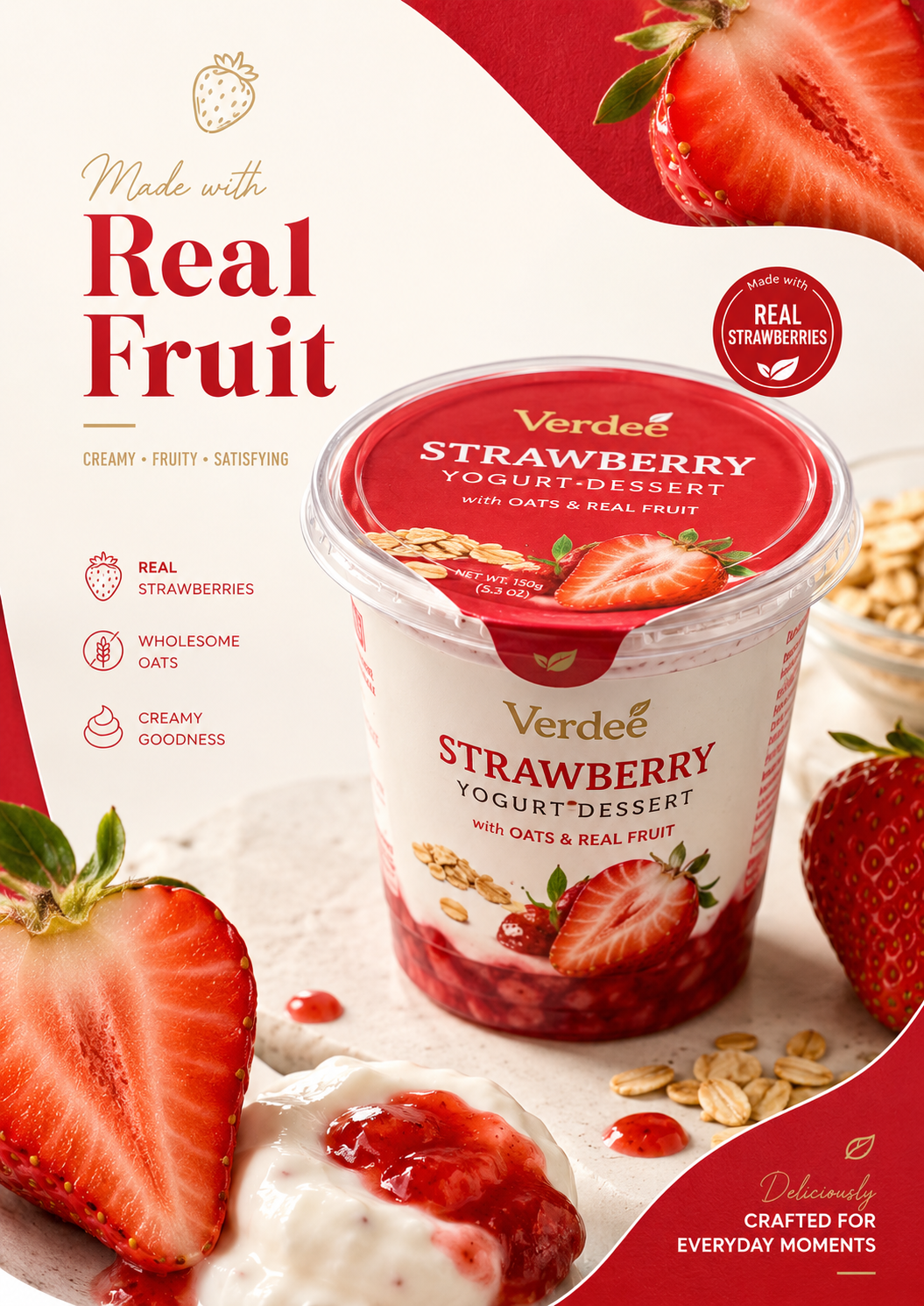
Organic Cutout Food Hero
Some products were never meant for airy soft light: gift boxes, spirits, fragrance, high-end packaging. They need weight—shadow, plinth, gold, distance in space.
Museum Black Stage Hero
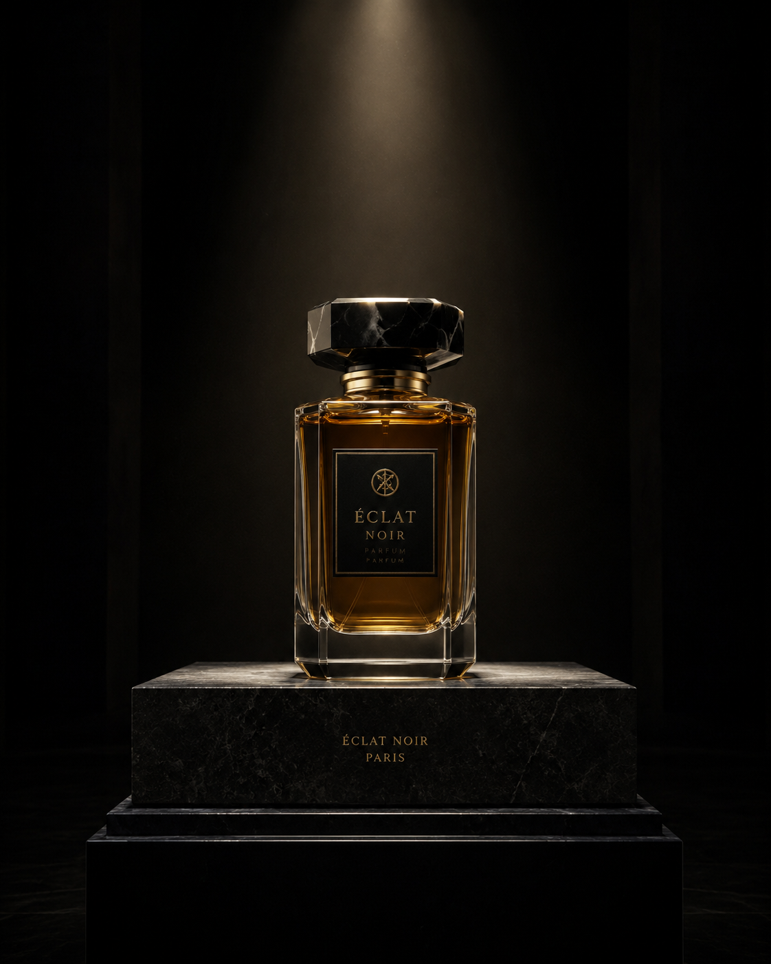
Museum Black Stage Hero
Warm Gold Giftbox Launch Light

Warm Gold Giftbox Launch Light
The real problem isn’t that AI images look bad; it’s that different categories get sanded into one aesthetic—soft, clean, a little dewy. Fine alone; together, the product’s personality fades.
Real brands shouldn’t all sound the same. Tech can run colder, food fresher, gifts heavier; skincare owns soft and dewy. Next time you write a prompt, write less clean, soft, premium and ask what temperament the SKU actually needs—performance, appetite, texture, or ritual.
In Draftroom we split those directions into separate prompt cards—not to make everything more “premium,” but to return each product to its own visual language, so the output isn’t another pretty skincare-ad lookalike.