Ecommerce7 min read
Why Your AI Product Photos Still Feel Fake
Four common gaps—weight, material, light, and scene—and which Draftroom prompt cards fix each one.
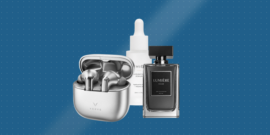
Many AI product images look fine at first glance, then fall apart on a second look. The product is perfect, the background is perfect, the light is perfect—yet the frame still lacks the weight of a real brand shoot.
Most people respond by stacking words like realistic, ultra realistic, premium, or commercial photography. The image may improve slightly, but the “fake” feeling often remains. What is missing is not more adjectives—it is the relationships real product photography depends on.
In a real product photo, the object relates to the surface it sits on, to the light, to its materials, and to the scene around it. When those relationships are weak, you get something that looks expensive but is hard to use.
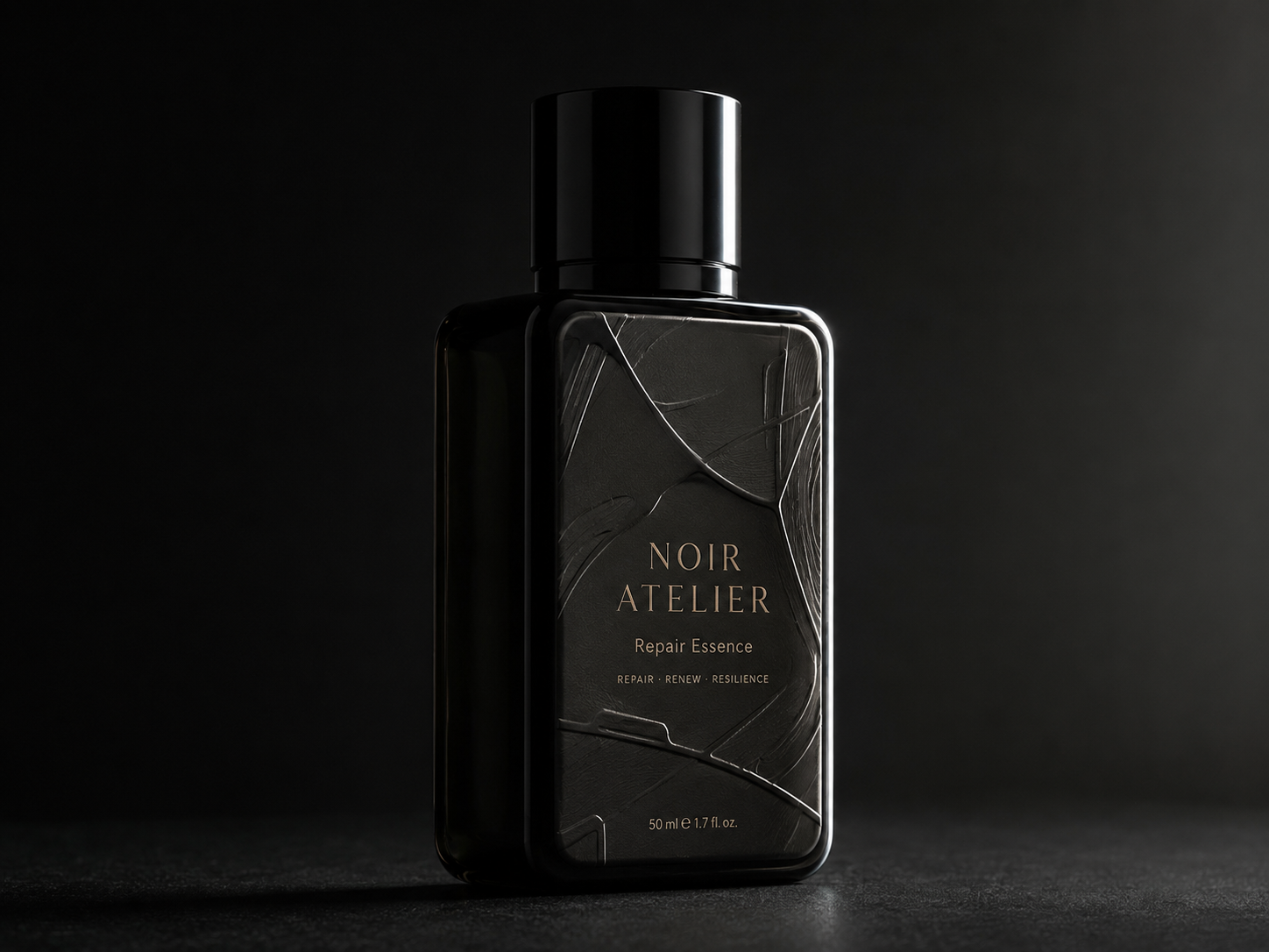
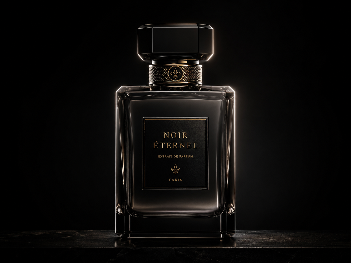
Fake feeling #1: no weight
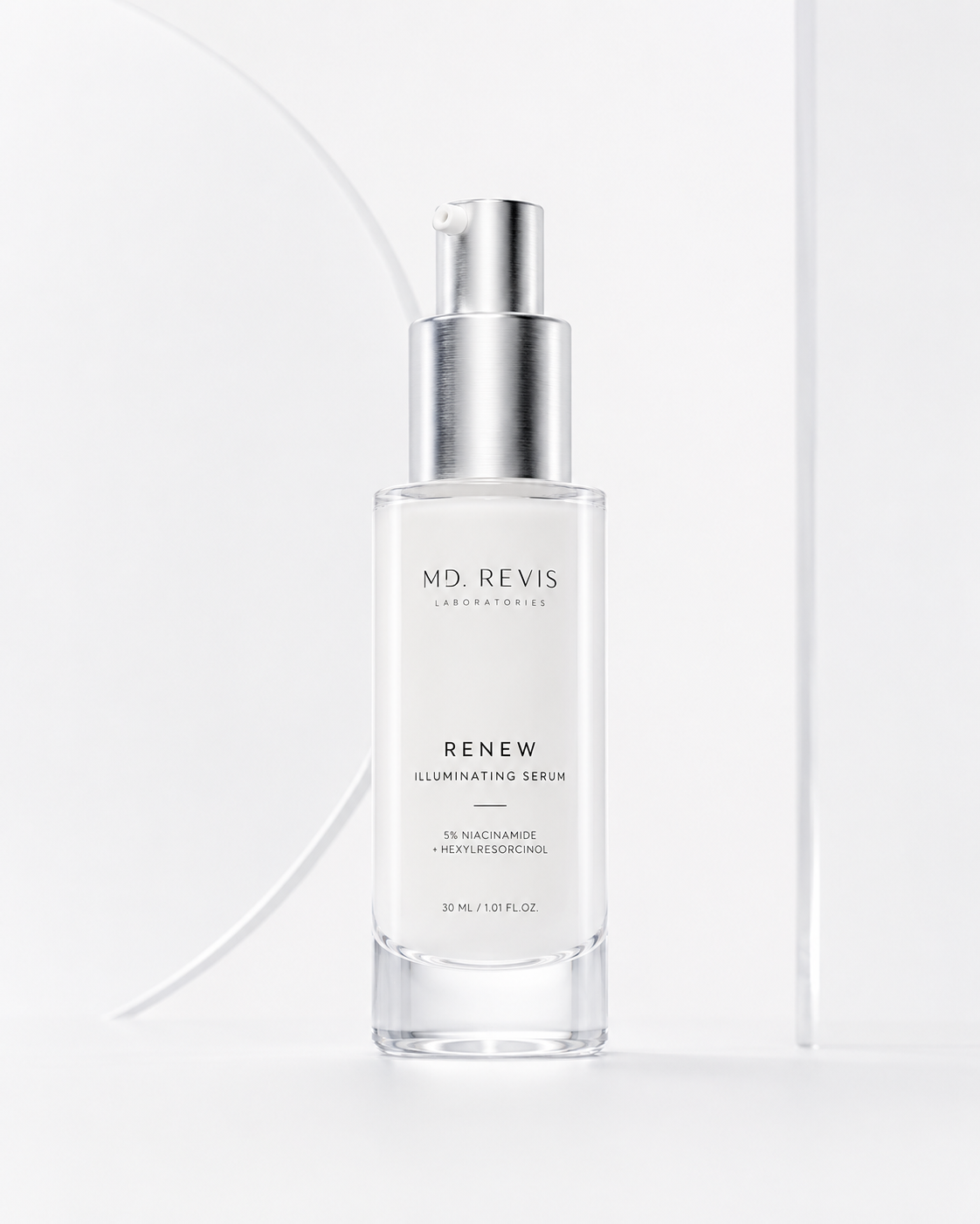
The product feels like it is floating. There is no believable contact at the base—especially painful for bottles, ceramics, metal tins, and beauty packaging.
Start with grounding: put the product clearly on a table, counter, pedestal, or controlled white cyclorama. Two reliable directions:
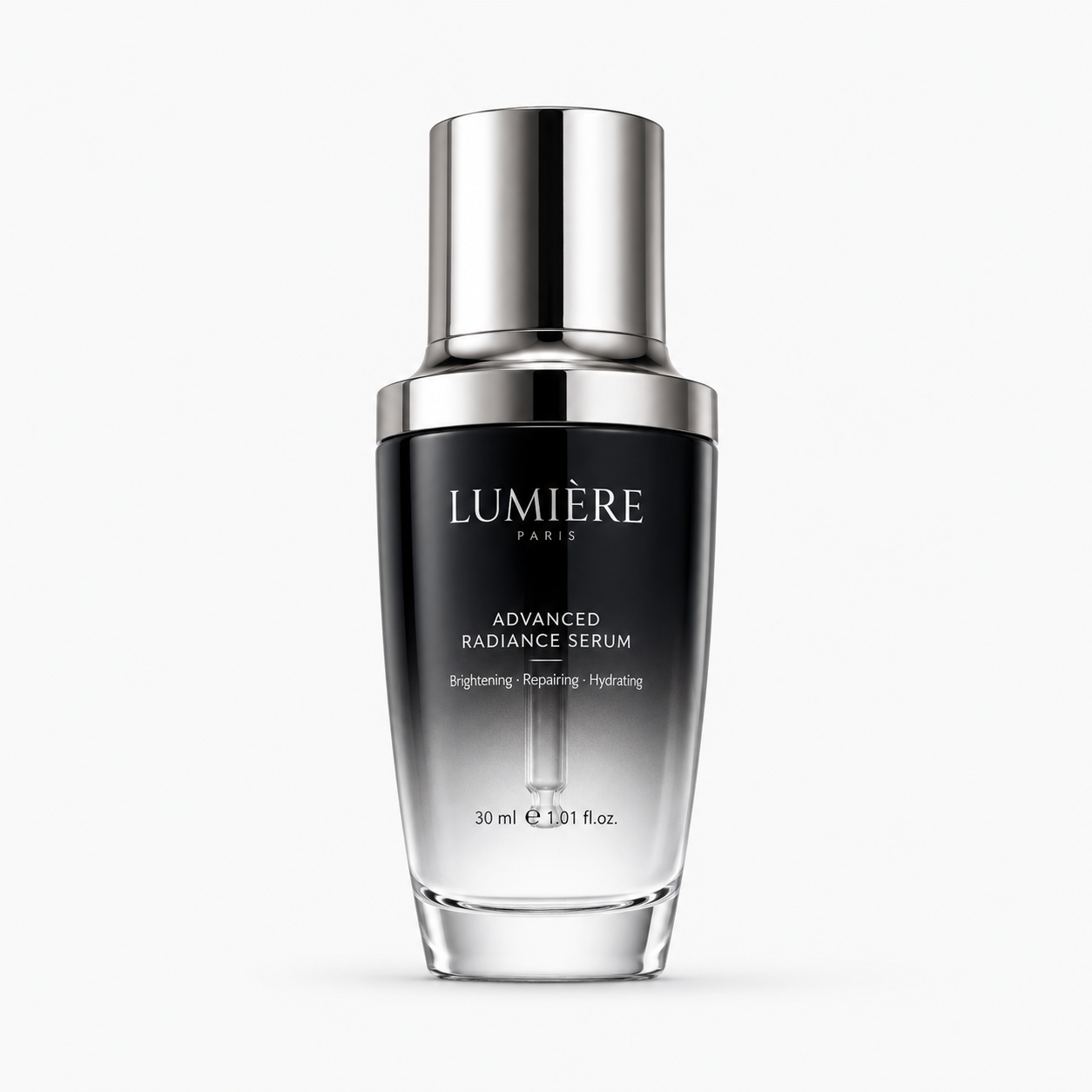
Top Light Volume
Top Light Volume
Pure White Studio Hero
Pure White Studio Hero
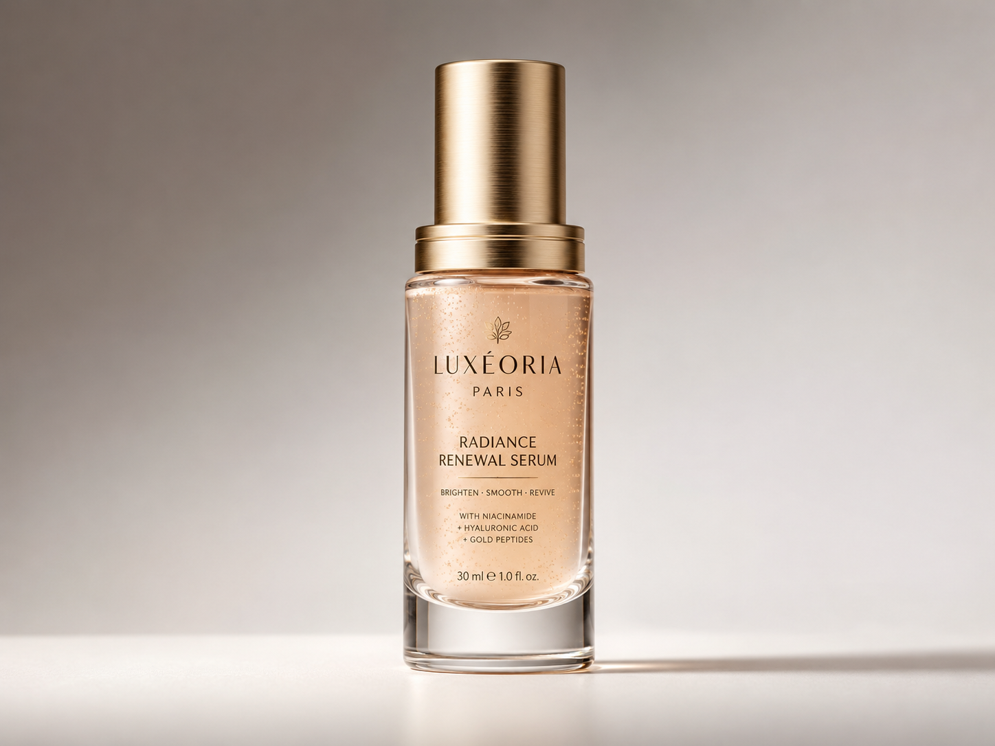
Fake feeling #2: every material looks the same
AI often smooths glass, metal, paper, ceramic, plastic, and fabric into one digital skin. In real commerce work, material difference is the product.
In prompts, split “material” from a single vague adjective. Instead of premium material, specify: glass reads thick with edge refraction; metal gets narrow edge highlights; paper keeps light grain; plastic stays matte and diffuse.
If material is your main problem, try:
90 Degree Side Sculpt
90 Degree Side Sculpt
Side-Back Contour
Side-Back Contour
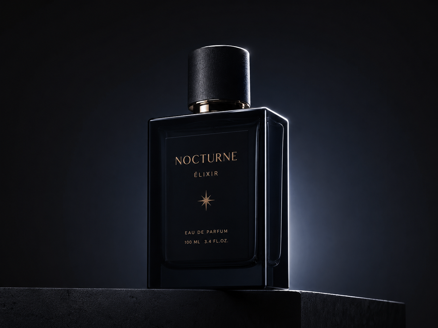
Fake feeling #3: light is too even
Front bright, sides bright, background bright—no hierarchy. Real lighting chooses what to show and what to hold back; that choice builds volume and focus.
Pick one clear lighting strategy first. For a safe default, use 45° side key. To separate subject from background, use rim / contour. For launch drama, use spotlight on dark.
45 Degree Side Key
45 Degree Side Key
Rim Outline
Rim Outline
Spotlight Luxury Product KV
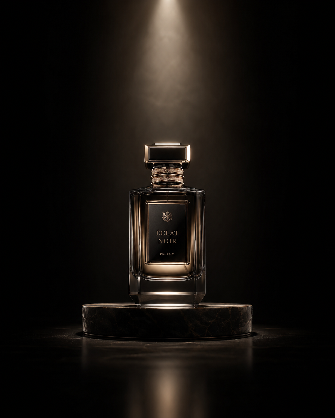
Spotlight Luxury Product KV
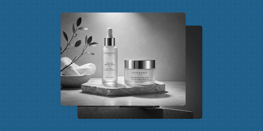
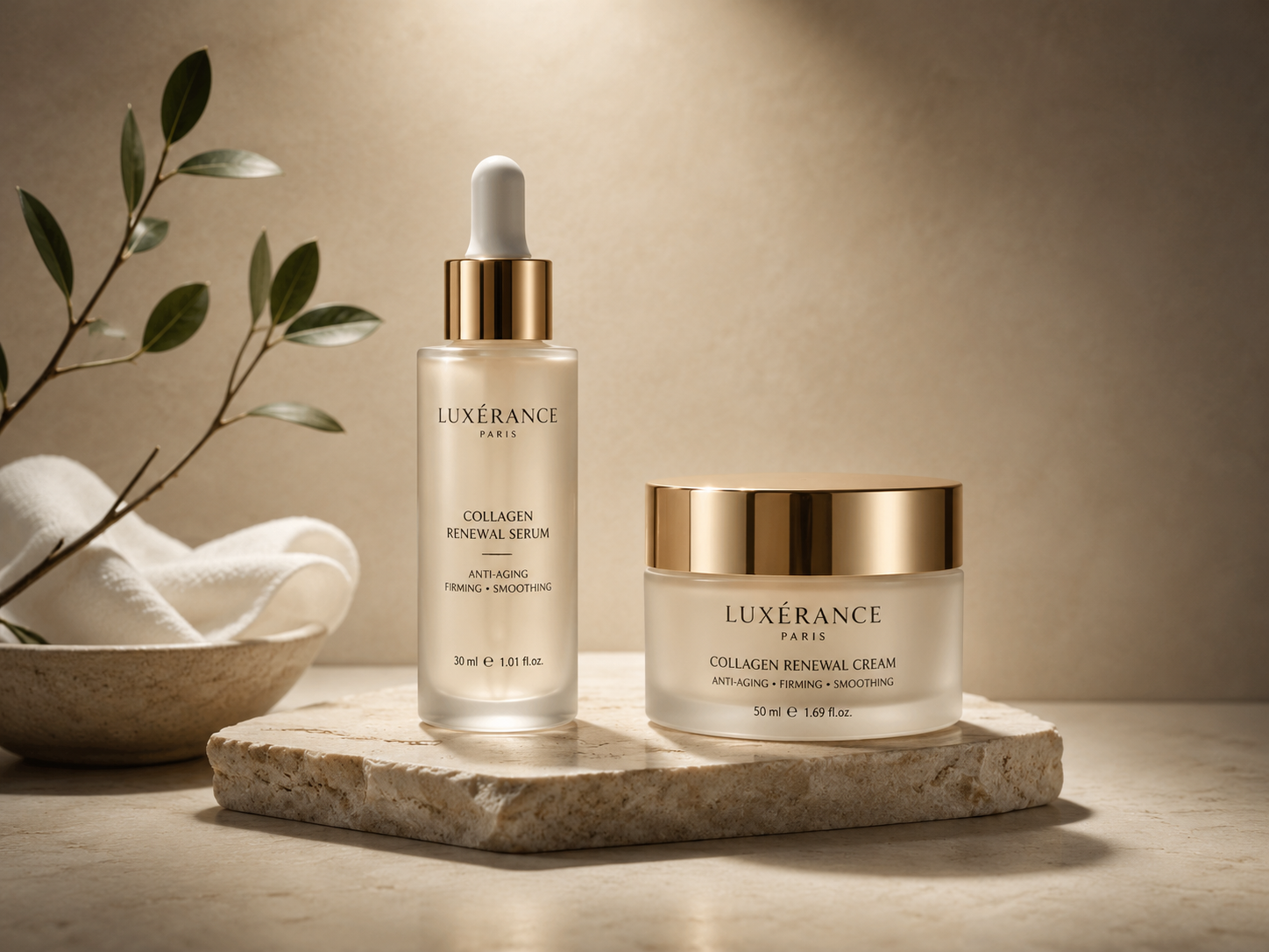
Fake feeling #4: the scene feels like a showroom
Clean desk, soft backdrop, perfect props—everything too smooth. Lifestyle work does not need clutter, but it needs reason: why is the product here, who uses it, and how do nearby objects support that story?
Skincare on a bathroom counter can include towel, steam, mirror reflection. Coffee on a desk can include a laptop, notebook, morning window light. Fragrance near a vanity or fabric reads more honestly than “generic luxury room.” Cut decorative props; add use logic.
Front Fill Packshot
Front Fill Packshot
Natural Window Product Light
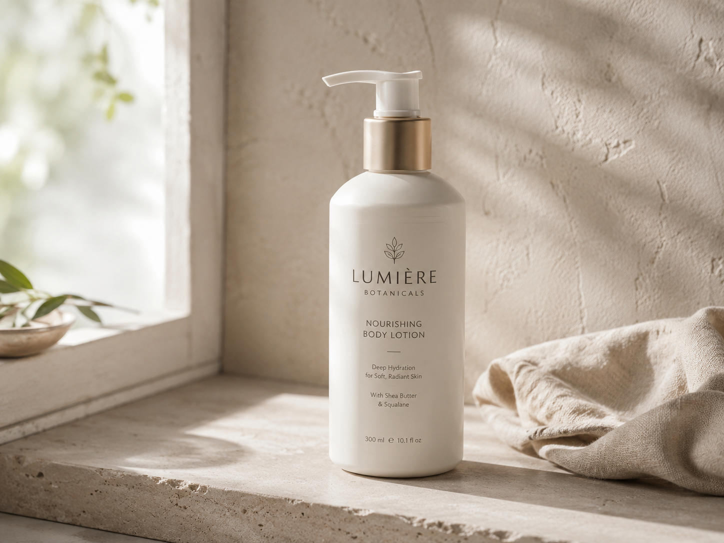
Natural Window Product Light
Before you add “ultra realistic” again
Ask which gap you are fixing: weight, material, light, or scene. When that choice is clear, images lose a lot of generic AI gloss—and start to look like visuals a brand could actually ship.
In Draftroom we split these problems into prompt cards. You do not need a giant paragraph from scratch: pick whether you need grounding, material, light, or scene first—then tune product and brand temperament on top.