UI Components8 min read
Don’t Mistake Whitespace for Premium—or Density for Professional
Page density follows the user’s task: understand first, compare next, then browse at high information load.
AI-generated UI often swings to two extremes. One is too empty: huge whitespace, one headline, one button—looks premium, says too little, and users do not know why to act. The other is too full: cards, tags, charts, data—looks professional, feels exhausting, and the focal point disappears.
Density is not an aesthetic pick. It is a task pick.
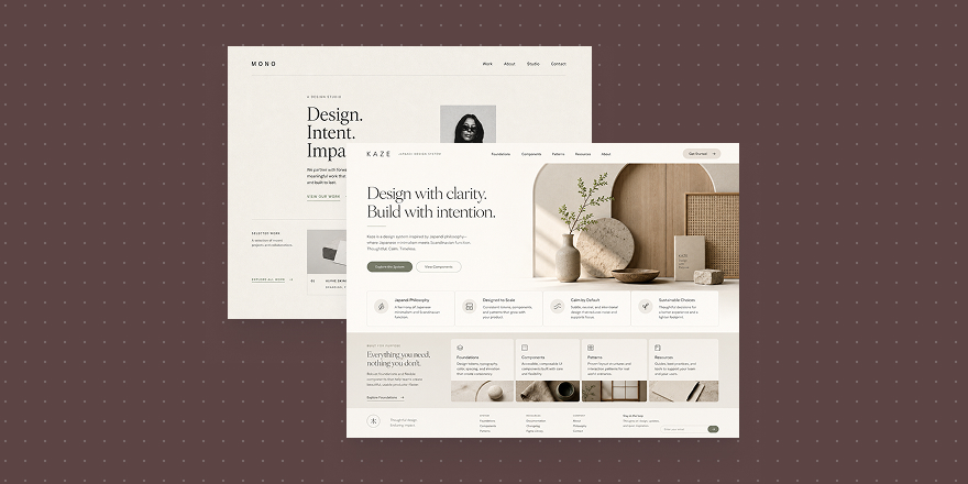
When users first land, they need to understand. Brand intros, marketing heroes, and product story pages should answer who you are, what you solve, and what to do next. Whitespace helps only when it serves hierarchy—clear headline, visible product, copy and CTA in the right places.
Minimal White Space Brand Poster
Minimal White Space Brand Poster
Cards like this fit site heroes and sell pages. The point is not “fancy emptiness,” but a readable path where product, title, and action work together.
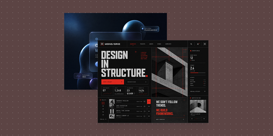
When users compare options—pricing, feature matrices, plan pickers—they need more information. Too much air raises decision cost. Group content so they know what to read first and second.
High Contrast
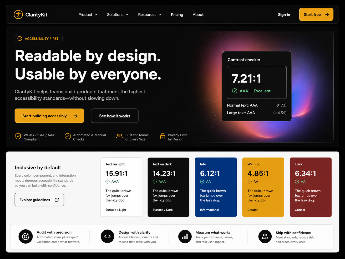
High Contrast
High-contrast direction suits pricing, comparison, and feature explainers—pulling out differences, limits, and next steps faster.
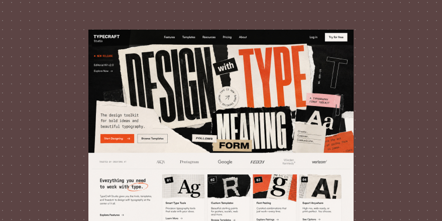
When users come to browse catalogs, indexes, libraries, or workspaces, the page can be denser. High density is fine; chaos is not. Stable modules, clear categories, and predictable scan rhythm matter. Users already expect to process information—the screen should not pretend to be a brand poster.
Type Collage
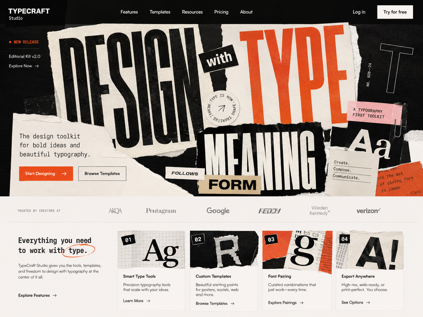
Type Collage
Type-collage direction fits collections, directories, resource walls, and visually rich high-load layouts—more material while keeping rhythm and organization.
Whitespace is not automatically premium. More information is not automatically professional. Match density to the moment: understand, compare, or execute.
In Draftroom, cards help you pick page rhythm first—guided whitespace, contrast for decisions, or dense browsing. Get density right and the page actually works.