UI Components7 min read
Don’t Let AI Draw the Page First—Define Your UI Rules
Set product temperament and component rules before generating screens, so every page stays on one system.
Many people start AI UI work by asking for a page: a dashboard, a landing page, an app home. The first image often looks fine—but the second screen, settings, forms, modals, and empty states rarely fit. The model gave you a picture, not the rules behind it.
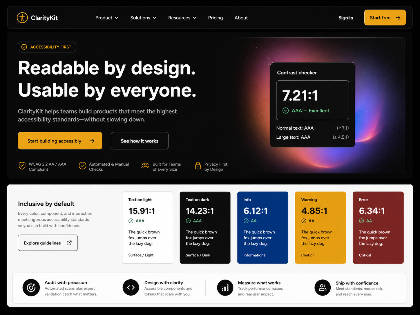
How should color behave? How do type levels work? How many button states exist? How do card spacing, form errors, empty states, and alerts stay consistent? Without answering these first, every new page feels like day one again.
So step one is not “draw me a page.” It is “define a rule set.”
That visual language should answer: Is this product calm or approachable? High or low information density? More tool-like or more brand-like? Those choices shape radius, saturation, spacing, type scale, and whitespace.
Efficiency tools, B2B consoles, and data products usually need a cooler, clearer baseline:
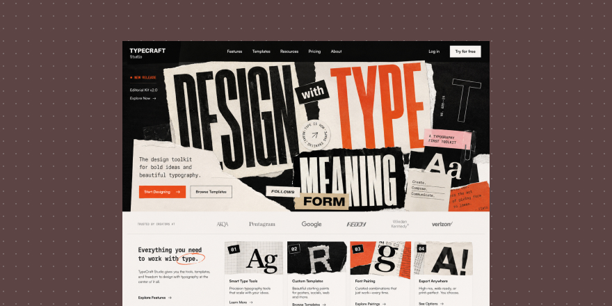
Minimal / Clean

Minimal / Clean
Health, lifestyle, learning, and personal products can sit closer—users need to feel ease and trust, not only finish a task:
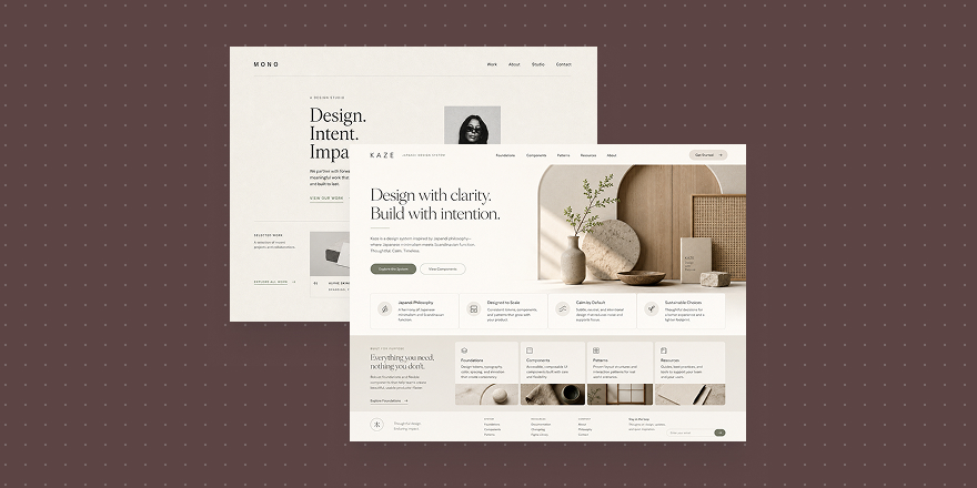
Japandi
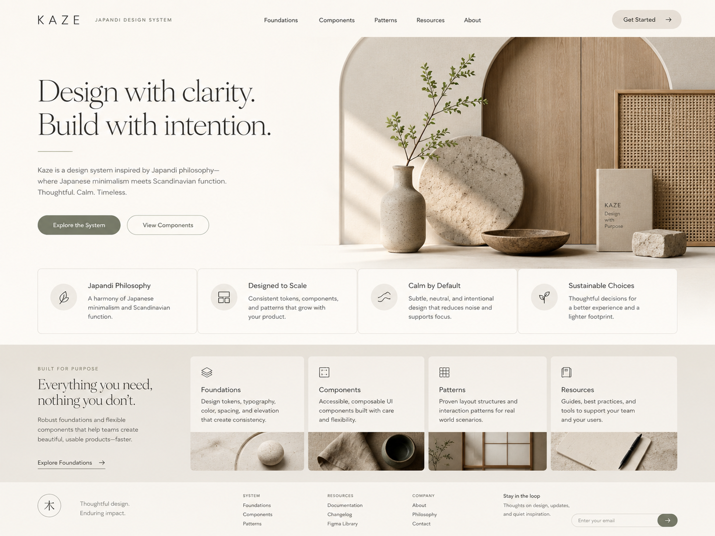
Japandi
When information is dense or users must read status fast, “clean” is not enough—hierarchy and contrast come first:
High Contrast
High Contrast
Try this order with AI: temperament → color, type, spacing, radius, component states → then concrete pages.
In Draftroom, Style cards are not just skins. They are a starting point for temperament, then tokens, components, and layout—so generation yields a direction you can reuse, not a one-off pretty frame.